How The Smiths Adapted a Vietnam War Photograph for the Cover of 'Meat Is Murder'
📰 Original title: The Story Behind the Iconic Artwork for The Smiths’ 1985 Studio Album “Meat Is Murder”
🤖 IA: It's not clickbait ✅
👥 Users: It's not clickbait ✅
View full AI summary https://en.killbait.com/how-the-smiths-adapted-a-vietnam-war-photograph-for-the-cover-of-meat-is-murder.html?utm_source=mastodon_world&utm_medium=social&utm_campaign=killbait.mastodon_world
How The Smiths Adapted a Vietnam War Photograph for the Cover of 'Meat Is Murder'
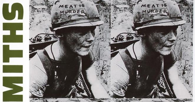
The article examines the origins of the cover artwork for The Smiths’ 1985 album 'Meat Is Murder', one of the band's most recognizable visual images. The cover features a modified photograph of American Marine Corporal Michael Wynn, taken during the Vietnam War on September 21, 1967. The image was originally used in promotional materials and archival footage associated with the 1968 anti-war documentary 'In the Year of the Pig', directed by Emile de Antonio. In the original photograph, Wynn had written the slogan 'Make War Not Love' on his military helmet, reflecting the era’s countercultural sentiments. For the album cover, The Smiths’ lead singer Morrissey, who was heavily involved in selecting the band's artwork, worked with designer Caryn Gough to alter the image. The original helmet message was replaced with the phrase 'Meat Is Murder', matching the title of the album and its vegetarian-themed title track. According to Morrissey, the comparison between military violence and the treatment of animals in the meat industry was intentional and designed to provoke discussion. The article notes that Michael Wynn survived the war and later moved to Australia in 1982. Neither Wynn nor the photographer was reportedly asked for permission before the image was modified and used on the album sleeve. Wynn only became aware of his unexpected connection to the famous record when his sister recognized the album in a store after its release. He initially expressed dissatisfaction with the alteration of the original slogan on his helmet. Over time, critics and historians have reflected on the image’s broader symbolism, suggesting that it unintentionally resonated with the experiences of many Vietnam veterans who returned home feeling exploited, misunderstood, and discarded by both the military system and society.