 hrbrmstr's Daily Drop
Drop #646 (2025-04-30): Web-Slinging Wednesday
CSS text-box-trim; 12-Bits; CSS Shapes
We’ll use the midweek Drop as a literal palette cleanser as we cover some clever CSS capabilities.
Type your email…
Subscribe
TL;DR
(This is an LLM/GPT-generated summary of today’s Drop using Ollama + Qwen 3 and a custom prompt.)
I did switch over to Qwen 3 and, so far: so good!
- CSS
text-box-trimenables precise control over vertical text spacing by trimming excess space above and below text, improving alignment and optical balance (https://developer.chrome.com/blog/css-text-box-trim) - Kate Morley’s 12-bit rainbow palette uses LCH color space for perceptually uniform data visualization with minimal chroma variation and smooth luminance transitions (https://iamkate.com/data/12-bit-rainbow/)
- CSS Shapes Module Level 1/2 introduces properties like
shape-outsideandshape-insidefor non-rectangular content flow, with Level 2 addingshape-insideandshape-paddingfor advanced layout control (https://developer.mozilla.org/en-US/docs/Web/CSS/CSS_shapes)
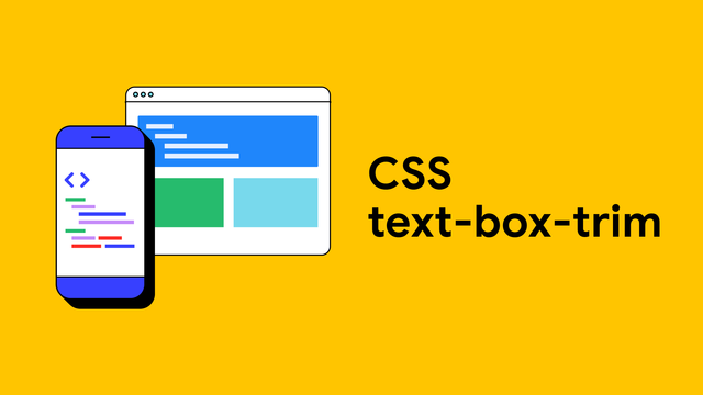
CSS text-box-trim
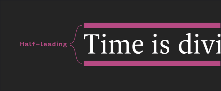
CSS text-box-trim is a new property designed to give us precise control over the vertical space above and below text within its container, addressing a long-standing challenge in web typography and layout. Historically, the space around text — especially the extra space above and below — has been dictated by the font’s metrics and the web’s handling of “half-leading,” which splits the line spacing (leading) equally above and below the text. This often results in inconsistent and unpredictable spacing, making it difficult to achieve optical balance and true alignment, especially when working with different fonts or aiming for perfectly centered text in buttons, badges, or headings.
The property allows you to trim the “over” (top) and “under” (bottom) edges of a text box, effectively removing the extra vertical space that comes from the font’s internal metrics. This is particularly useful for components where you want equal padding or precise alignment with other elements, such as icons or images.
The syntax is straightforward:
text-box-trim: trim-both;trims both the top and bottom.text-box-trim: trim-start;trims just the top.text-box-trim: trim-end;trims just the bottom.text-box-trim: none;(default) makes no adjustment.
We can pair text-box-trim with text-box-edge to specify exactly where the trimming should align-such as the top of capital letters (cap), the x-height of lowercase letters (ex), or the baseline (alphabetic):
This example trims the top to the cap height and the bottom to the alphabetic baseline, which is a common use case for visually balanced headings.
Before this new properts we often had to use trial and error with padding values to make text look optically centered in buttons or aligned with adjacent images. For example, you might set padding-block: 5px and padding-inline: 10px to offset the unwanted space, but this solution is fragile and varies across fonts and platforms. With text-box-trim, you can confidently use equal padding (e.g., padding: 10px) and know the result will be visually balanced.
Many demos and playgrounds like this one are now available to help us see and tweak these effects in real time. We can experiment with different fonts, trim values, and see how trimming only one side or both affects the layout.
As of early 2025, text-box-trim is supported in Chrome 133+ and Safari 18.2+, with ongoing work for broader adoption.
The linked post has some great examples, links, and more technical details.
12-Bits
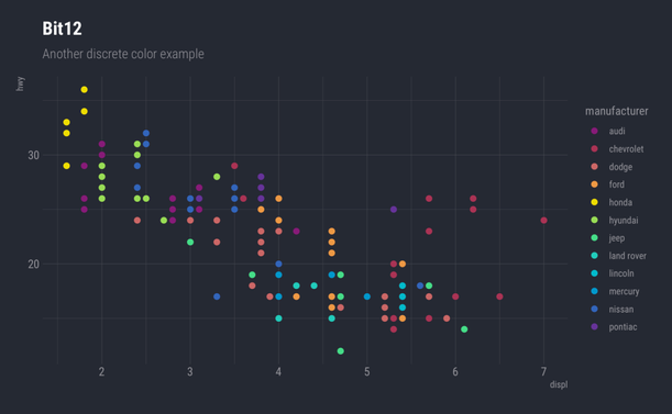
Kate Morley designed the 12-bit rainbow palette with twelve carefully chosen colors for data visualization. This palette debuted in the National Grid: Live project, focusing on human color perception across luminance, chroma, and hue.
As we’ve somewhat covered in more than a few Drops, standard RGB color systems treat red, green, and blue equally, but human vision processes these differently. Green appears brighter than red, while blue looks darker. This creates jarring brightness shifts in RGB-based rainbow palettes, causing problems in visualizations needing smooth transitions.
Kate addressed this using the LCH (Luminance, Chroma, Hue) color space. LCH offers perceptual uniformity, where equal numerical changes in any component create visually equivalent changes regardless of starting color. When varying hue while keeping chroma and luminance constant, colors appear equally spaced to viewers.
Simply fixing chroma and luminance while changing hue doesn’t produce an effective rainbow. Yellow looks muddy at low luminance, red becomes pink at high luminance, and blue appears washed out with increased luminance. The solution allows controlled luminance variation: yellow receives the highest luminance (since yellow only appears yellow when bright), with red and blue serving as anchors. Luminance for other hues creates smooth transitions across the spectrum.
The “12-bit” name refers to color depth: each palette color uses just four hexadecimal digits (like #e94), equaling 12 bits of information. This constraint slightly limits available colors, but adjustments required for 12-bit compatibility remain visually imperceptible. The result features evenly spaced hues, minimal chroma variation, and smooth luminance variation, creating an effective and compact visualization tool.
Here are some handy, pre-built data structures for the palette for R, JavaScript, and CSS, plus a full set of {ggplot2} palettes in {hrbrthemes}:
c( plum = "#817", rose = "#a35", coral = "#c66", apricot = "#e94", lemon = "#ed0", lime = "#9d5", mint = "#4d8", teal = "#2cb", sky = "#0bc", azure = "#09c", cobalt = "#36b", violet = "#639") -> bit12 const bit12 = ["#817","#a35","#c66","#e94","#ed0","#9d5","#4d8","#2cb","#0bc","#09c","#36b","#639"]; :root { --plum: #817; --rose: #a35; --coral: #c66; --apricot:#e94; --lemon: #ed0; --lime: #9d5; --mint: #4d8; --teal: #2cb; --sky: #0bc; --azure: #09c; --cobalt: #36b; --violet: #639;}CSS Shapes
The CSS Shapes Module Level 1 and Level 2 specifications introduce modern and spiffy ways to control how content flows around and within elements using arbitrary shapes, moving beyond the traditional rectangular box model.
Module Level 1 focuses on defining shapes for float areas.
A float area is the region defined around a floated element that determines how surrounding inline content, such as text, wraps around it. By default, when you float an element using the float property (with values like left or right), the float area is the element’s margin box, meaning the content wraps around the outermost edge of the element, including its margins.
It introduces properties like shape-outside, which allows a floated element to define a non-rectangular float area using basic shapes (such as circle(), ellipse(), polygon(), inset(), and path()) or by referencing images and box edges (like margin-box or border-box). These shapes determine how inline content wraps around floats. For example, you can float an image to the left and use shape-outside: circle(50%) to make text wrap around a circular area instead of the image’s rectangular bounds. The module also introduces shape-margin, which expands the float area outward from the defined shape, and shape-image-threshold, which sets the opacity cutoff for extracting shapes from images. Importantly, these shapes only reduce the float area-they cannot extend it beyond the float’s margin box, and the underlying box model, including stacking and positioning, remains unaffected. The module is strictly limited to floats and initial-letter boxes, although it anticipates future expansion to other elements and contexts.
Module Level 2 builds on this foundation by extending shape application beyond floats to exclusions and, perhaps more importantly, by introducing the shape-inside property. With shape-inside, you can define a non-rectangular area inside a block-level element, causing the element’s content to flow within the specified shape, rather than filling the usual rectangle. This enables layouts such as text flowing inside a circle or along a custom path. Level 2 also introduces the shape-padding property, which adds padding inside the shape defined by shape-inside, analogous to how shape-margin works outside shapes. The new shape() function is a more flexible and CSS-native alternative to the SVG-inspired path(), allowing for dynamic, parametric, and responsive shapes using standard CSS syntax, units, and variables. Additionally, Level 2 allows referencing SVG shapes directly via url() and expands the image-based shape extraction mechanism. The properties from Level 1, like shape-outside, shape-margin, and shape-image-threshold, are updated to apply to exclusions and the new inside shapes as appropriate.
It’s much easier to see/play how this all works (though it is important to read through the specs).
MDN has a super nice resource for this, and the code for the section header can be found in their playground.
You can also find tons of pre-built CSS shapes on sites like “The Ultimate CSS Shapes Collection”.
FIN
Remember, you can follow and interact with the full text of The Daily Drop’s free posts on:
- 🐘 Mastodon via
@dailydrop.hrbrmstr.dev@dailydrop.hrbrmstr.dev - 🦋 Bluesky via
https://bsky.app/profile/dailydrop.hrbrmstr.dev.web.brid.gy
☮️
 hnbot
hnbot Alexandre B A Villares 🐍
 Tommy Mintz