

Brian Bucklew
@unormal
- 2.6K Followers
- 281 Following
- 4.8K Posts
A semi-sentient colony of self-assembling, cooperative, biological nano-units. Still somewhat functional, despite its age. | Caves of Qud & Sproggiwood
The FTL Kickstarter was 14 years ago in February
people are concerned about all kinds of different food but wait till they find out how toxic oxygen is
unfortunately this is going to work so I'm actually going to have to build this whole thing lol
love a serendipitous accidental perfection
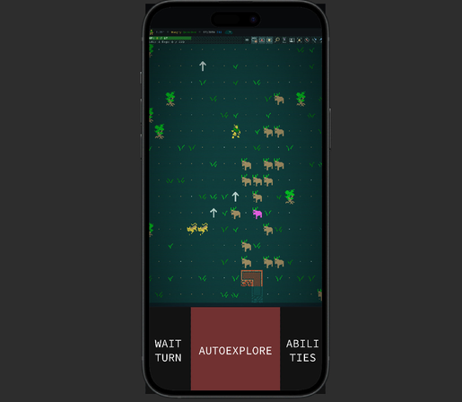
like that display is actually 16x16 tiles o.O
honestly kind of shockingly comfy even in very nascent form
all the tiles being stylized as simple glyphs and phone screens being insanely high res and focused on letting you read high density glyphs does a lot of work
the tiles being high instead of square is also pretty nice for the portrait layout; finally the text based roots comes full circle and non-square tiles makes sense again. time is a flat circle etc
you might say one is known and one is unknown but they are actually uncertain to the same degree
might switch my career from speculative futurist to speculative historian