I might be weird, but that vintage, filmic lens look in corporate videos feels distracting—and dishonest. It’s not art; it’s communication.
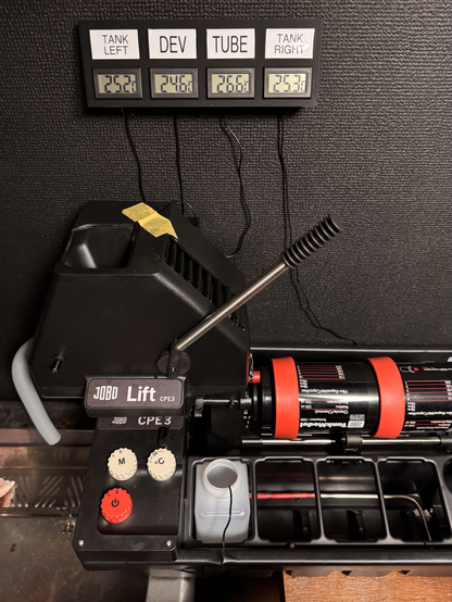
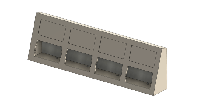
For people with darkrooms and JOBO systems: I made the precise temperature control panel a month ago. Gives quite a bit of confidence with the temperatures when working with color film or prints.
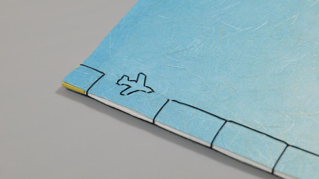
https://ttvl.co/darkroom/thermometer-panel-for-jobo-systems/I made a new book maquette: A Chair in the Sky—a book of snapshots I made while raw-dogging long hauls from the seat-back “down view” camera feed. Hand-bound.
https://toto.photo/maquettes/a-chair-in-the-sky/This screen from the keynote violates one of the guidelines from the session: the larger the visual mass of the background, the less transparent it should be. Notifications are about 20% of the entire screen each.
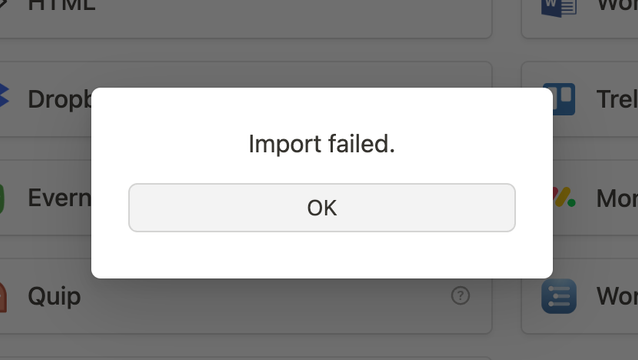
I’m trying to give a
@notionhq a go, but this is my life now. (Archive has super-simple *.md files.)
Still my favorite part of all the “AI things.”
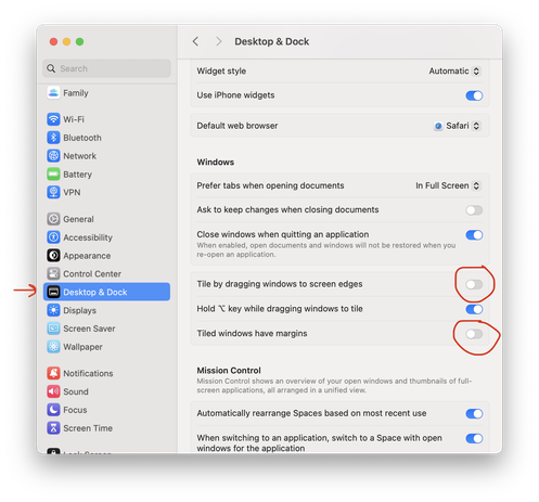
I'm not a fan of window managers. Fortunately, you can enable it ONLY when pressing ⌥. It's nice of Apple to have options to remove margins when windows are tiled.
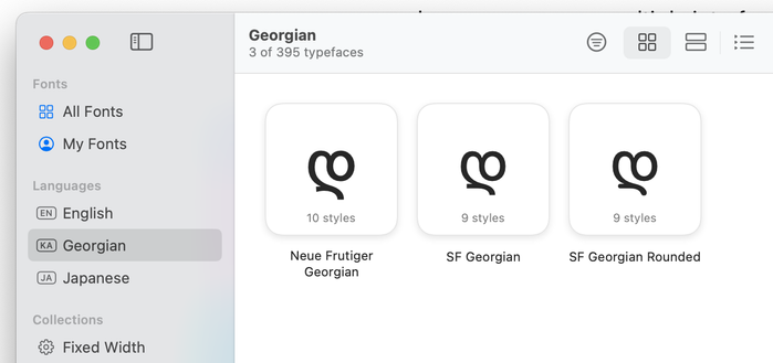
It is interesting to see that Font Book chooses the Georgian letter D (დ) to represent the alphabet. Latin, Cyrillic, and even Japanese/Hiragana use A (あ). The Georgian alphabet also starts with A (ა), and it's a pretty cute glyph, too.