| Flickr | https://www.flickr.com/photos/geckzilla/ |
| ORCID | https://orcid.org/0000-0002-2617-5517 |
| Flickr "verified" | https://www.flickr.com/people/geckzilla/ |
Judy Schmidt
- 162 Followers
- 313 Following
- 1.3K Posts
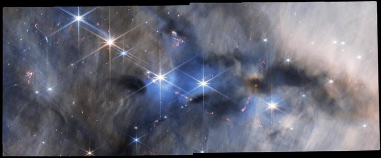
HOPS 383
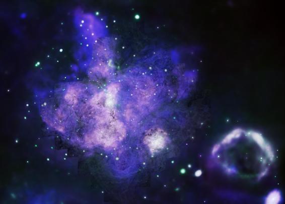
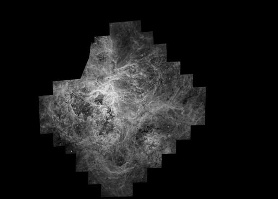
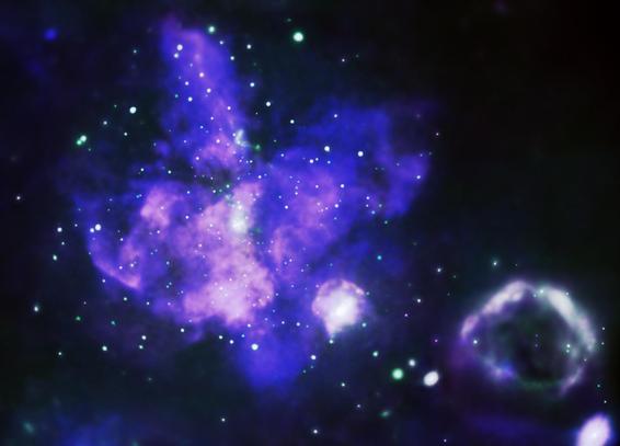
So I came up with this method, which is not something I've done before that I recall. Rather than layering light upon light, I actually used the visible portion on "multiply" mode, which is a way of darkening the layers underneath it. I thought it looked good, made those hard edges much less visibly obtrusive, and helped each dataset add meaning to the other.
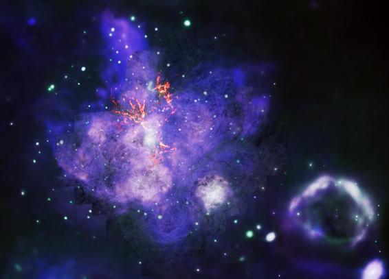
And then, the reason for avoiding warm colors until now, was so I could add radio data to the image, and have it be discernable from the rest.
Looking at the press release (https://chandra.harvard.edu/photo/2025/30dor/), I see that's not at all what got published, and that's fine. Instead, the visible light portion is now presented as orange, and the edges have been feathered. Some infrared data from Spitzer also was added.
