Home
Explore
mastodon.social
mstdn.social
infosec.exchange
mstdn.jp
social.vivaldi.net
piaille.fr
hachyderm.io
mastodon.world
troet.cafe
m.cmx.im
mastodon.uno
mastodon.gamedev.place
social.tchncs.de
mastodon.nl
norden.social
flipboard.social
kolektiva.social
mathstodon.xyz
mastoturk.org
nrw.social
tech.lgbt
occm.cc
defcon.social
mstdn.ca
mastodonapp.uk
universeodon.com
c.im
masto.es
sueden.social
toot.community
mstdn.party
det.social
sfba.social
mastodon.scot
tkz.one
ohai.social
mastodon.ie
ruhr.social
hessen.social
mastodontech.de
mastodon.sdf.org
mastodon.nu
pouet.chapril.org
livellosegreto.it
mastodon.au
social.linux.pizza
mastodont.cat
mastodon.eus
indieweb.social
social.cologne
ioc.exchange
muenchen.social
ieji.de
mastodon.bida.im
mastodon.green
feuerwehr.social
social.anoxinon.de
wehavecookies.social
masto.nu
nerdculture.de
ruby.social
mindly.social
mastodon.ml
metalhead.club
phpc.social
uri.life
m.otter.homes
mastodontti.fi
dresden.network
toot.wales
qaf.men
sunny.garden
climatejustice.social
noc.social
sciences.social
privacysafe.social
mstdn.plus
bark.lgbt
tooting.ch
freiburg.social
blorbo.social
hostux.social
rollenspiel.social
furry.engineer
mastodon.me.uk
rivals.space
mastodon.com.pl
gaygeek.social
bonn.social
urbanists.social
mast.lat
mastoart.social
rheinneckar.social
mastodon-belgium.be
expressional.social
discuss.systems
wien.rocks
h4.io
mapstodon.space
ursal.zone
masto.pt
mstdn.games
todon.nl
hcommons.social
snabelen.no
glasgow.social
fairy.id
sakurajima.moe
shelter.moe
lgbtqia.space
cupoftea.social
darmstadt.social
tilde.zone
mastodon.gal
urusai.social
retro.pizza
ludosphere.fr
mastorol.es
bookstodon.com
qdon.space
muenster.im
peoplemaking.games
mastodon.berlin
socel.net
toot.aquilenet.fr
mast.dragon-fly.club
veganism.social
vmst.io
pawb.fun
kanoa.de
union.place
mstdn.dk
witter.cz
toad.social
machteburch.social
mastodon.uy
theblower.au
xarxa.cloud
oslo.town
eupolicy.social
musicworld.social
tooot.im
burningboard.net
masto.nyc
fandom.ink
stranger.social
gardenstate.social
mstdn.business
cultur.social
disabled.social
4bear.com
tea.codes
graphics.social
mountains.social
thecanadian.social
freeradical.zone
pnw.zone
hear-me.social
mustard.blog
furries.club
bahn.social
mastodon.pnpde.social
musician.social
toot.kif.rocks
fedi.at
dizl.de
musicians.today
libretooth.gr
babka.social
ciberlandia.pt
archaeo.social
ani.work
dmv.community
vkl.world
mastodon.energy
tyrol.social
toot.re
tuiter.rocks
frikiverse.zone
masto.nobigtech.es
drupal.community
lou.lt
gamepad.club
social.seattle.wa.us
mast.hpc.social
fulda.social
donphan.social
social.silicon.moe
tchafia.be
is.nota.live
puntarella.party
toot.si
bzh.social
social.politicaconciencia.org
muri.network
hometech.social
mastodon.vlaanderen
norcal.social
wargamers.social
lsbt.me
datasci.social
mograph.social
mastodon.africa
theatl.social
opencoaster.net
toot.funami.tech
drumstodon.net
devianze.city
hispagatos.space
epicure.social
elekk.xyz
est.social
toot.garden
friendsofdesoto.social
mastodon.pirateparty.be
apobangpo.space
indieauthors.social
mastodon.education
kurry.social
mstdn.animexx.de
mastodon.london
mastodon.cr
lewacki.space
ruhrpott.social
hoosier.social
colorid.es
fikaverse.club
leipzig.town
esq.social
planetearth.social
library.love
fairmove.net
mastodon.bot
burma.social
frontrange.co
techtoots.com
toots.nu
mastodon.wien
fribygda.no
raphus.social
mastodon-swiss.org
h-net.social
arvr.social
cwb.social
rheinhessen.social
rail.chat
opalstack.social
paktodon.asia
mastodon.sg
seocommunity.social
poweredbygay.social
khiar.net
epsilon.social
camp.smolnet.org
bologna.one
mastodon.free-solutions.org
stereodon.social
okla.social
k8s.social
episcodon.net
elizur.me
genealysis.social
mastodon.cipherbliss.com
growers.social
birdon.social
masto.yttrx.com
biplus.social
mastodon.hosnet.fr
skastodon.com
squawk.mytransponder.com
mastodon.frl
mastodon.babb.no
balkan.fedive.rs
silversword.online
cville.online
23.illuminati.org
ailbhean.co-shaoghal.net
lounge.town
mastodon.ph
mastodon.iow.social
kzoo.to
kcmo.social
mastodon.bachgau.social
mcr.wtf
social.diva.exchange
synapse.cafe
mastodon.bahia.no
nfld.me
social.ferrocarril.net
mastodon.ee
voi.social
darticulate.com
polsci.social
troet.fediverse.at
nautical.social
fpl.social
mikumikudance.cloud
mastodon.mg
social.sndevs.com
nomanssky.social
dariox.club
bvb.social
kjas.no
nwb.social
ms.maritime.social
ceilidh.online
netsphere.one
nutmeg.social
wxw.moe
computerfairi.es
learningdisability.social
Log In
samutara
@
[email protected]
0 Followers
67 Following
119 Posts
Posts
Posts & Replies
Media
Show thread
samutara
Nov 22, 2023
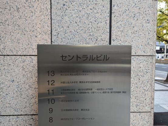
And in contrast, the building name as it appears on the Japanese sign: in a standard, sans-serif katakana
#font
.
0
0
0
samutara
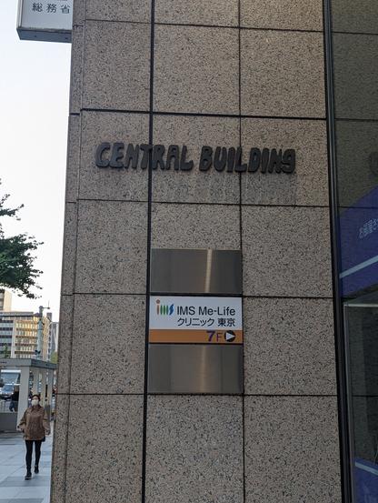
Nov 22, 2023
Puzzling
#font
choice: the logo for the "Central Building" (セントラル ビル) near Tokyo Station on the Yaesu side. The logo appears to be a bubbly, hand-drawn bit of text with a sort of 1970s feel.
1
0
0
samutara
Oct 9, 2023
Does your neighborhood tell you about the warning signs of oral cancer?
Do they try to scare the crap out of you when they do?
0
0
0