What happened to namecheck.fontdata.com 😢
| Website (Type) | https://maitype.xyz/ |
| Website (Digital) | https://thy-ha.com/ |
| Website (Type) | https://maitype.xyz/ |
| Website (Digital) | https://thy-ha.com/ |
Did you know the typeface Gotham turns 25 years old next year?
Did you know the inspiration for Gotham started from a single sign on the Port Authority Bus Terminal in NYC?
Did you know Gotham was nearly named “Equator” or that Tobias Frere-Jones was concerned that the name “Gotham” was too connected with Batman comic books to be taken seriously?
Grab a coffee and spend 20 minutes reading my article over three years in the making:
Every time I read @klim's design info, it takes me hours (yes, hours! English isn't my first language). I keep one note full of new vocabulary and another that's just a collection of quotes I love from his essays. My favourite one I saved today from the Die Grotesk essay is the one in this image, it's so relatable. I also learnt that 'greasies' (pronounced "gree-zeez") means fish and chips 🐟 🍟
You can read more here
https://klim.co.nz/blog/die-grotesk-design-information/


Die Grotesk was shaped in the long shadow of Helvetica, a typeface both revered and resented in equal measure. Graphic designers love it. Type designers hate it. Endlessly revived and resold, simultaneously banal and sublime, its forms feel inevitable. A typeface so familiar it feels like air.

We did use a good amount of additional Javascript to add some of the features we wanted. Most of them are in support of a better user experience, like filtering the list of families in the Fontdue testers.
But some of them were more about having fun, like the little outline editor in the about page. It’s meant to be a bit of a joke, like “Here, try editing this outline, see how easy or difficult you find it to draw a letter”.
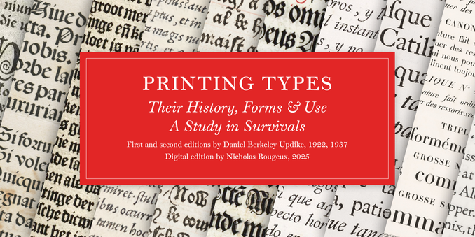
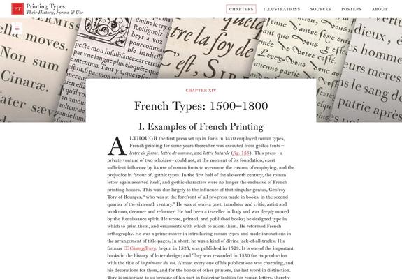
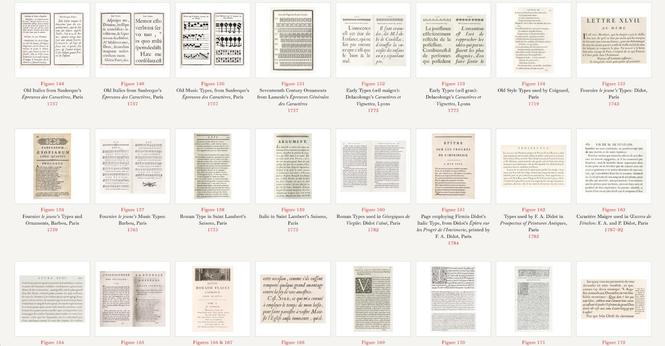
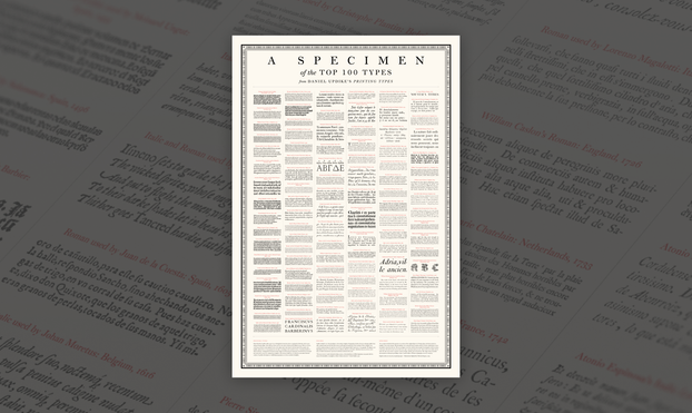
New: I went on a months-long treasure hunt for 1,200+ books spanning 450+ years to digitize Daniel Updike’s Printing Types from 1922, detailing the history of printing and typography. Made a nifty poster too.
Explore: https://www.c82.net/printing-types
How it was made: https://www.c82.net/blog/?id=100
We've just finished moving our @ohno Type School course Essential @RoboFont to YouTube! (Still) Free for everyone!
https://youtube.com/playlist?list=PLSvIkPS1TorJNFLBPx0R4zOs3dm-HsCn-&feature=shared
