I'm not sure if this is a recent trend or not, but my favorite thing I've noticed about UI design lately is using off-white / paper-like background colors. I find it to be so much more soothing than stark white UI. Claude being the most recent example.
Seeing lots of weird bugs with the automatic dark mode with icons on iOS18.
Why is this off by default on the eero app?? This will save so much headache from having to turn WiFi on and off on devices to get them to switch to the closest eero.
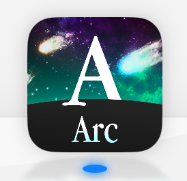
Arc Search on mobile wins the internet for their amazing throwback app icon
This Apple Maps 3d view bug looks like a disaster scenario
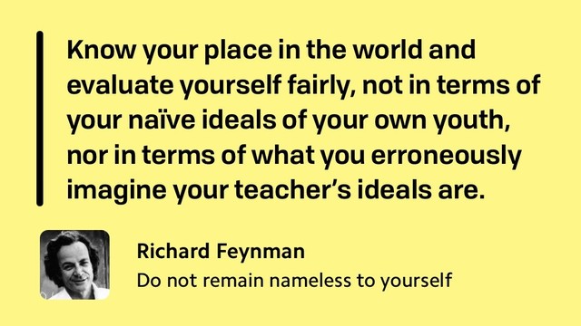
This one was my favorite 😄
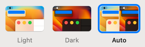
For some reason I decided to switch from "Dark" -> "Auto" today.
"Know your place in the world and evaluate yourself fairly, not in terms of your naïve ideals of your own youth, nor in terms of what you erroneously imagine your teacher’s ideals are."
http://web.archive.org/web/20200517015343/https://lettersofnote.com/2015/10/23/do-not-remain-nameless-to-yourself/

Do not remain nameless to yourself
Above: Richard Feynman in 1984In 1966, nine years after gaining his Ph.D. with a dissertation titled The Self-Energy of the Scalar Nucleon, physicist Koichi Mano wrote a congratulatory letter to Ri…