Laurence Penney

@lorp@typo.social
564 Followers
343 Following
225 Posts
Font hacker. I made Axis-Praxis and Samsa, and am helping to get the OpenType enhancements avar2 and COLRv1 off the ground. I co-produced MyFonts and FauxFoundry, and currently co-organize Letter Luvvers. I like trains, cars, book cataloguing, one-dimensional maps and Claudius Ptolemy.
webhttps://www.lorp.org
GitHubhttps://github.com/Lorp
Letter Luvvershttps://www.instagram.com/letterluvvers/
emaillorp@lorp.org
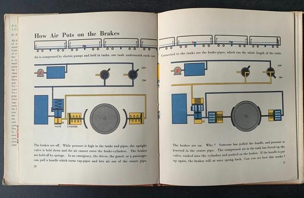
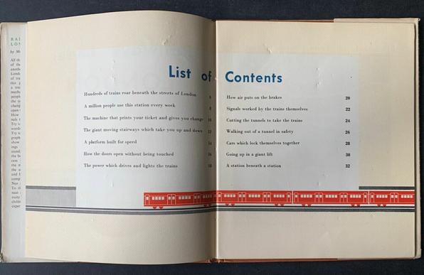
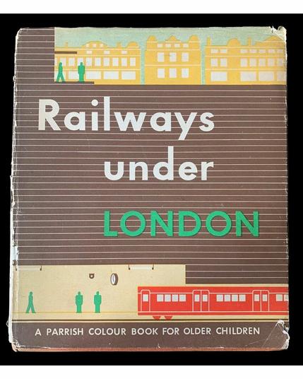
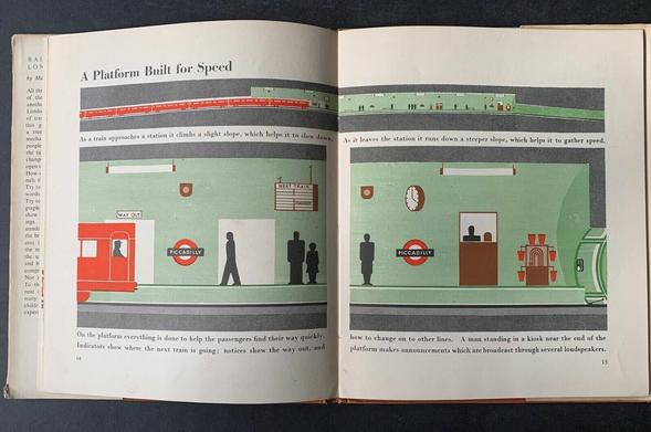
Finally got a copy of Marie Neurath’s “Railways Under London” (1948). Cheapest available seems to be £1500… mine was orders of magnitude less!
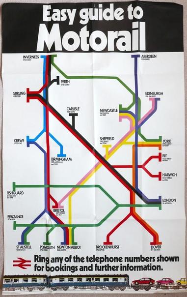
Do you like my new Motorail poster?
[BRB double royal sized coloured map poster ‘Easy Guide to Motorail’ showing the routes of the services. Dated 1979. Folded.]
Is there a word for books that are difficult to catalogue because of divergent titles on cover, title page and spine, and titles that differ between editions?
Is this T design common in Russia or only Ukraine? (Kherson, earlier today)
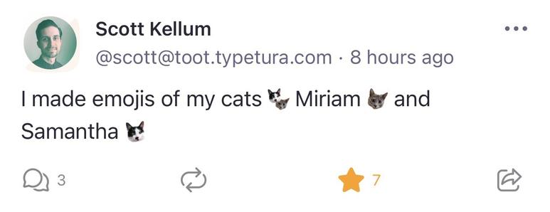
One of the joys of running your own server is the power to create your own emojis. @scott runs toot.typetura.com and has made emojis for each of his cats. Adorbs!
And also none of that ?s=…t=… rubbish that you get when you copy a Twitter link (remarkably, @jack@twitter.com has only just noticed this)
The slides deck of my ATypI talk is here. It’s all about the OpenType avar table, version 2. (With speaker notes too, so you get almost all that I said!) #avar2 https://docs.google.com/presentation/d/1jLiUvh4PoYz2sw0T0Fygj2HoMrBhmJQuGgAmoMc_Sns/
avar2 for ATypI October 2022

Mom, You Sure Can Rehydrate a Pizza (or: avar table version 2.0) Upgrading the ‘avar’ table so Variable Fonts can: Distort the designspace Blend parametric axes Sync HOI axes Get even smaller Thanks to ATypI for putting this conference together and for the opportunity to show this work. This talk...
Google Docs
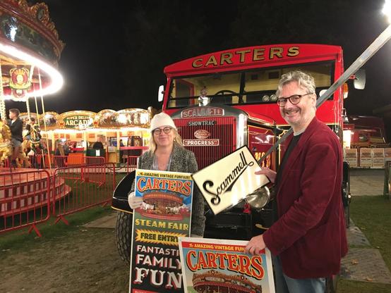
At Carters Steam Fair with Sara Chapman, a Scammell ShowTrac (1948) and a lovely handpainted Scammell sign.
And here’s the railway guide from London to Southampton (1845) with a 1:12.4 aspect ratio.
Let’s see how this thing deals with extreme aspect ratios. Here’s the 88:1 Bayeux Tapestry.
×
Is this T design common in Russia or only Ukraine? (Kherson, earlier today)

@lorp It is a traditional variant form that is probably familiar to most Cyrillic readers. Just think of it as Т with really long serifs on the end of the bar.

The same construction sometimes occurs in lowercase even when the uppercase is the more famliar Т shape, as in Gabriola (below), and is what leads in cursive to the lowercase italic т looking like a Latin m.

@lorp Fontfabric’s introductory article on the origins and development of Cyrillic script shows some examples of this form in use in poluustav (semi-uncial) and early cusive styles.

https://www.fontfabric.com/blog/cyrillic-tradition-origins-and-inception/

Cyrillic Tradition: Origins and Inception - Fontfabric™ Blog

Among the myriad of national holidays celebrated by the Slavic community, one date stands out for reasons of historical significance and cultural synthesis.

Fontfabric™ Blog
@lorp This form is also common in poluustav, which suggests how the three-legged version evolved.
@TiroTypeworks Thanks, indeed I know the ‘m’ form well from handwriting and Bulgarian lowercase — nice to see it in chunky form in Gabriola and Poluustav. Luc(as) de Groot reminisced to me the other day about the eye-opening variety of forms in Crimea, which made we wonder about vernacular use of this uppercase form.
@lorp @TiroTypeworks I've seen it on official buildings and large-scale signage, so it's not relegated to informality/"handmade look" styles, at least.
@lorp I have no idea but there was a talk on Granshan about Ukrainian forms of letters. I believe some of it is now on YouTube.