This is the best summary graphic for my training cycle that I've come up with so far.
data and a bit of exploration over here: https://observablehq.com/d/a2c0b7952cab9a02


| website | https://billmill.org |
| github | https://github.com/llimllib |
This is the best summary graphic for my training cycle that I've come up with so far.
data and a bit of exploration over here: https://observablehq.com/d/a2c0b7952cab9a02
Even as a skeptic, this is neat.
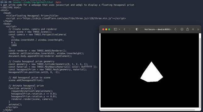
I ask gpt to write me a webpage that displays a floating hexagonal prism, and it nails it. This is just a screenshot, the camera is rotating around the object.
(I get that this is a near-ideal circumstance for gpt, basically a slight modification to every first tutorial. Still, I think it's neat)
syntax highlighting theme designers consistently make the color of code comments too dim. My preference is to use color to distinguish code from comment, and increase the contrast to make it more readable.
For example, default github gist syntax colors comments in desaturated light grey, versus a darker green option:
Maine was going to bid on the Olympics and host it here! There were plans to develop the Bigelow ridge into the biggest ski area in the eastern US.
When that fell through, the voters of Maine passed a referendum in 1976 to acquire the mountain and keep it as a preserve https://www.newenglandskihistory.com/cancelledskiareas/Maine/bigelowmtn.php
Here's what the Bigelows look like from Sugarloaf:

I guess I fixed it, but I had to change my script so that it re-encodes the video clip instead of copying. It's a bit slower but much more accurate now.
`ytgif -v -start 1:58 -finish 1:59.9 -caption "damn you" 'https://www.youtube.com/watch?v=tskpXGAJMhw' damn.gif`
https://github.com/llimllib/ytgif
To ffmpeg I say (in the nicest way):

The Portland Townsman, a local online publication (if that makes sense), is putting out some of the most beautiful charts I've seen online anywhere. All of these are from thetownsman.org
(The writing is great too)
