| Portfolio | http://lisacharlottemuth.com |
| https://twitter.com/lisacmuth |
Lisa Charlotte Muth
@lisacrost@vis.social
- 1,065 Followers
- 223 Following
- 179 Posts
Creating & writing about dataviz for Datawrapper. Data Vis Book Club organizer. Fan of numbers, systems & overviews. I believe in maps, not the territory.
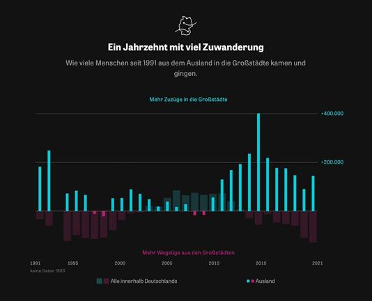
Remember "The Millions Who Left" by the super talented people at ZEIT Online? They did it again. If you want to see some fine #dataviz today, visit their article about how many people move away from and to big German cities: https://www.zeit.de/gesellschaft/2023-01/deutsche-grossstaedte-bevoelkerungsentwicklung-zuzuege-wegzuege
@kristinHenry Thanks, Kristin :)
@Jessel Aw, thank you for your beautiful words, Jessel!
@maarten Thanks, Maarten. Wonderful indeed! (And thankfully not too heavy yet...)
@shepazu Well, thank you for the kind words!
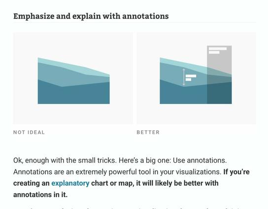
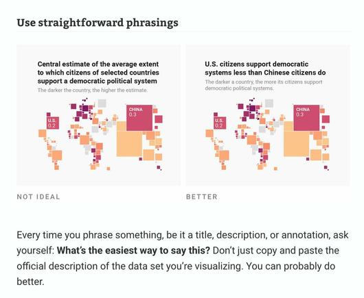
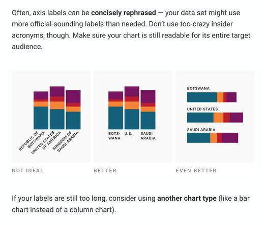
Text might be the most neglected part of #dataviz. We talk a lot about how the right chart type and colors can improve visualizations – but not enough about how to use words well.
So I wrote about that in my latest article: https://blog.datawrapper.de/text-in-data-visualizations/
I wrote about something new: typography for data vis! When should you use ᴜᴘᴘᴇʀᴄᴀꜱᴇ in your charts? 𝗯𝗼𝗹𝗱? narrow and thin fonts? lining numbers? multiplexed? 𝚖𝚘𝚗𝚘𝚜𝚙𝚊𝚌𝚎 and 𝐬𝐞𝐫𝐢𝐟 𝐭𝐲𝐩𝐞𝐟𝐚𝐜𝐞𝐬?
Find out here: https://blog.datawrapper.de/fonts-for-data-visualization/
Find out here: https://blog.datawrapper.de/fonts-for-data-visualization/
My latest @datawrapper@twitter.com blog post is about the *interpolation* of choropleth maps (or heat maps!) – what it is, which types exist, and why the type you choose matters so much for what your readers take away from your map.
Read it here: https://blog.datawrapper.de/interpolation-for-color-scales-and-maps/
Read it here: https://blog.datawrapper.de/interpolation-for-color-scales-and-maps/
If you have a #dataviz job in journalism, you should know about @source@twitter.com & their great
👉 blog: https://source.opennews.org/
👉 community calls: https://opennews.org/what/community/calls/
👉 conferences: https://srccon.org/
Help these smart, lovely people with your opinion: https://source.opennews.org/articles/survey-time-tell-us-about-your-work/


