Lisa Charlotte Muth

@lisacrost@vis.social
1,065 Followers
223 Following
179 Posts
Creating & writing about dataviz for Datawrapper. Data Vis Book Club organizer. Fan of numbers, systems & overviews. I believe in maps, not the territory.
Portfoliohttp://lisacharlottemuth.com
Twitterhttps://twitter.com/lisacmuth
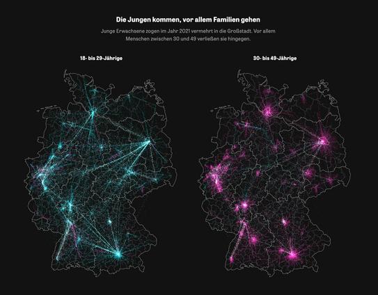
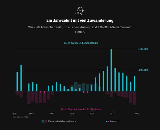
Remember "The Millions Who Left" by the super talented people at ZEIT Online? They did it again. If you want to see some fine #dataviz today, visit their article about how many people move away from and to big German cities: https://www.zeit.de/gesellschaft/2023-01/deutsche-grossstaedte-bevoelkerungsentwicklung-zuzuege-wegzuege
Deutsche Großstädte: Die Stadtflucht

Lange Zeit zogen die Menschen innerhalb Deutschlands in die Städte. Doch Daten zeigen, dass sich der Trend gedreht hat: Die Großstädte beginnen zu schrumpfen.

ZEIT ONLINE

Text might be the most neglected part of #dataviz. We talk a lot about how the right chart type and colors can improve visualizations – but not enough about how to use words well.

So I wrote about that in my latest article: https://blog.datawrapper.de/text-in-data-visualizations/

What to consider when using text in data visualizations

How to make your data visualizations easier to read (and more interesting to look at!) with the right use of text.

Datawrapper Blog
I wrote about something new: typography for data vis! When should you use ᴜᴘᴘᴇʀᴄᴀꜱᴇ in your charts? 𝗯𝗼𝗹𝗱? narrow and thin fonts? lining numbers? multiplexed? 𝚖𝚘𝚗𝚘𝚜𝚙𝚊𝚌𝚎 and 𝐬𝐞𝐫𝐢𝐟 𝐭𝐲𝐩𝐞𝐟𝐚𝐜𝐞𝐬?
Find out here: https://blog.datawrapper.de/fonts-for-data-visualization/
My latest @datawrapper@twitter.com blog post is about the *interpolation* of choropleth maps (or heat maps!) – what it is, which types exist, and why the type you choose matters so much for what your readers take away from your map.
Read it here: https://blog.datawrapper.de/interpolation-for-color-scales-and-maps/
How to choose an interpolation for your color scale - Datawrapper Blog

Natural, Quantiles, Linear, Custom – which option ist the best for your map? We explain all options for continuous (unclassed) and stepped (classed) data.

Datawrapper Blog

If you have a #dataviz job in journalism, you should know about @source@twitter.com & their great
👉 blog: https://source.opennews.org/
👉 community calls: https://opennews.org/what/community/calls/
👉 conferences: https://srccon.org/

Help these smart, lovely people with your opinion: https://source.opennews.org/articles/survey-time-tell-us-about-your-work/

Source: An OpenNews project

Last call: Come work with me and the great @rosemintzers@twitter.com at @Datawrapper@twitter.com! You still have until *next Sunday, July 17* to apply as a
✏️ Data Vis Writer: https://www.datawrapper.de/vacancy/data-vis-writer
🗣 Data Vis Evangelist: https://www.datawrapper.de/vacancy/data-vis-evangelist
My DMs are open in case you have any questions.
Data Vis Writer - Datawrapper

Join our team (remotely or in Berlin) and help others be successful with data visualization.

Datawrapper

Little color trick: When you feel like your colors don't harmonize with your background colors, try to
1. overlay your colors with the background color
2. choose blend mode "hue"
3. play around with the opacity until you're happy

Here's how to do that in Figma:

A question for all Arabic and Hebrew-speaking people out there: In a #dataviz in your language with a date/time x-axis, would you prefer it to go from right to left, or from left to right? (Polls in the next tweets!)

Examples: https://datadashboard.health.gov.il/COVID-19/general & https://inkyfada.com/ar/2021/08/20/%D9%82%D8%B6%D9%8A%D8%A9-%D9%86%D9%82%D9%84-%D8%A7%D9%84%D9%81%D8%B3%D9%81%D8%A7%D8%B7-%D8%A7%D9%84%D8%B4%D8%A7%D8%AD%D9%86%D8%A7%D8%AA-%D8%AA%D9%88%D9%86%D8%B3/

קורונה - לוח בקרה

דשבורד נתוני וירוס הקורונה בישראל מטעם משרד הבריאות הישראלי

That's exciting: I'll give a 4.5h workshop about colors in #dataviz at #ISVIS2022 on Sunday, May 8th – my most in-depth color workshop yet!

Join us for lots of hopefully useful information (and help me to build a giant data vis color wheel): https://www.eventbrite.com/e/rainbow-unicorns-and-grey-gridlines-colors-in-datavis-online-workshop-tickets-319744152367

Rainbow Unicorns and Grey Gridlines: Colors in Datavis (online workshop)

Learn how to make your charts and maps more beautiful, more accessible, and easier to read with colors

Eventbrite
The great @DataToViz@twitter.com and @Elijah_Meeks@twitter.com will be happy to hear that! I really learned to appreciate this tool freshly – or rather: even more – while working on the article.