laborandwait

15 Followers
73 Following
9 Posts
We are an independent type foundry specializing in the design and development of retail fonts and custom typography.
@klim this was news to me. I’m on it.
@klim yes

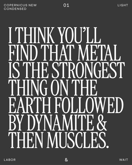
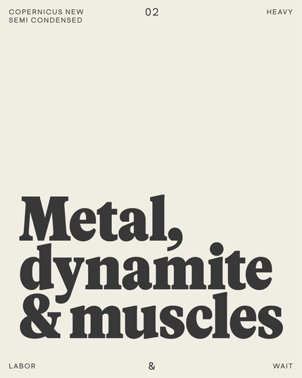
Copernicus Condensed is nearly ready to move from beta to release.
🀘🧨πŸ’ͺ

This is the current version of the lightest condensed style β€” DM us to trial it. We’re currently drawing Copernicus Semi-Condensed β€” it will be available in beta this March.

Cosmica Mono is the new companion to Cosmica β€” a geometric sans in a similar vein to the northern European originators of the style: Erbar-Grotesk (Jakob Erbar, 1926); Futura (Paul Renner, 1927); and Nobel (Sjoerd Henrik de Roos & Dick Dooijes, 1929).

#monospace #sansserif #typeface #typedesign #typography #alphabet #cosmicamono #cosmica

Esperanza was designed in 2022 for the Athens Cultural Center, in the Hudson Valley. The design was inspired by the lettering stamped into stoneware manufactured there throughout the 19th century at the Athens Pottery Works by Nathan Clark Senior and his partners and descendants.
NEW RELEASE: Esperanza includes a roman & an upright italic, along with a subtly-rounded stencil cut of both styles. Available for trial download now on laborandwait.xyz
Cosmica Mono is both larger and smaller than Cosmica in order to function in the monospace environment: the x-height and descender remain the same in both fonts, but the capitals are 8% shorter, and the ascenders are 5% shorter. The fonts include alternate schoolbook forms of a & y, an eyeglass version of g, and half-width versions of space & basic punctuation for a more polished option.
This never gets old. #weirdoshit