Just installed the update I was anticipating the most: flu + covid 26.
Props to California and my provider for brushing off the current CDC guidance and for following science and empirical data instead.
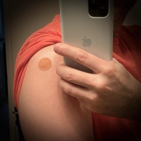

| Location | Santa Clara, CA |
Just installed the update I was anticipating the most: flu + covid 26.
Props to California and my provider for brushing off the current CDC guidance and for following science and empirical data instead.
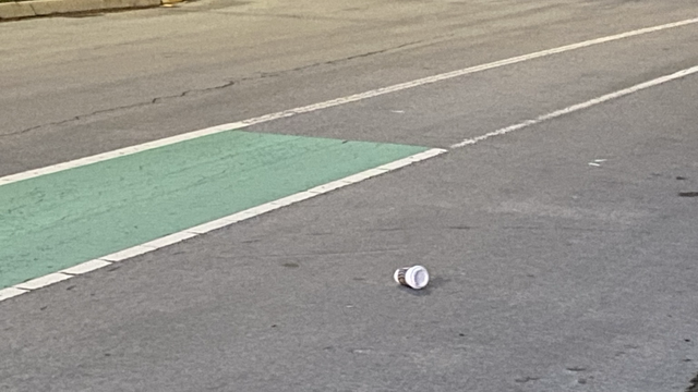
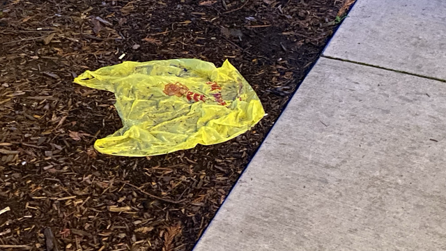
Jimmy Kimmel is right. A lot of places here are filthy beyond belief.
These photos are from a short walk around a neighborhood with above-average income in Silicon Valley. We are surrounded by uncivilized filthy pigs.
Don’t kill the messenger. Work on fixing the problem instead.

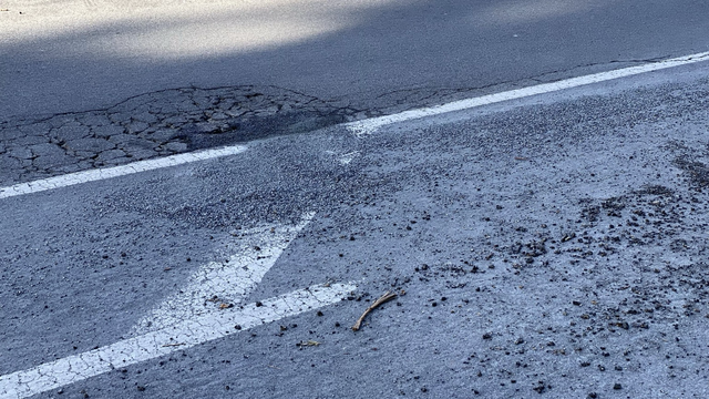
The city of San Jose, CA considers this to be a “fixed” pothole. This is ridiculous. It’s even worse than before the fix.
Besides not being fixed, now there’s a ton of loose gravel on the road. The level of incompetence and carelessness is astounding.
It’s not clear at all what happens when not in Silent Mode if I select options 2 or 3.
I hate this new trend of showing Settings as lists of text and more text. What was wrong with the 2 switches we had before?!

This feels unfinished.
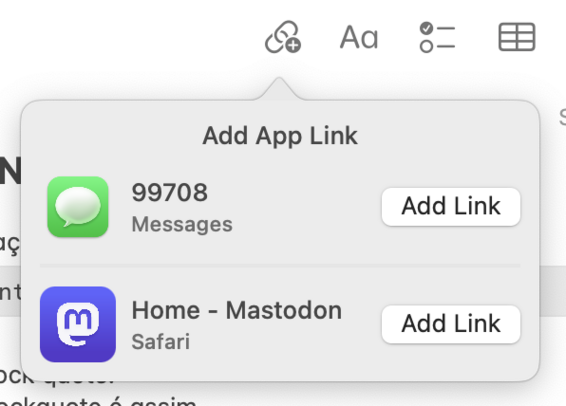
How is it that the “Add Link” toolbar button in notes shows this weird popover that only allows me to add a link to the frontmost website open in Safari (and Messages?!), but it doesn’t give me access to the new publicized feature of linking to other notes? I have to use the Edit > Add Link menu item for that.
Also, links between notes are useless without Back and Forward buttons.
You click a link and then what? Good luck manually finding the note where you came from?
The functionality is welcome, but not clipping by default is a baffling choice. Anyone can make any reason of this?
Also, that last sentence doesn’t make any sense to me.

watchOS 10 is the only update that has been a little frustrating for me so far:
– Cool new watch faces!
– Too many whole-screen transitions. UI does not feel as fluid. Maybe this just needs some getting used to.
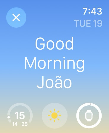
– Huge step back in readability. Very small text with very low contrast. Accessibility settings don’t seem to change a thing.
(I struggle to read the smaller white text on this very light blue background)

This display was awarded to me by Apple as part of the Apple Design Award that Versions app received in 2009.
It was used for the development of Versions app updates for 2 years after that.

I can’t find the new “Dim flashing lights” setting anywhere.
Searching for it shows one result, but then it’s nowhere to be seen.
Same on tvOS. It’s not there. 🤷🏻♂️


