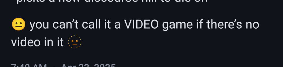
@evilroda They're two separate emoji, "neutral face" and "dotted line face". It looks like the emoji set on your app/device uses a filled version that looks pretty similar to neutral face. Here's how I see it.
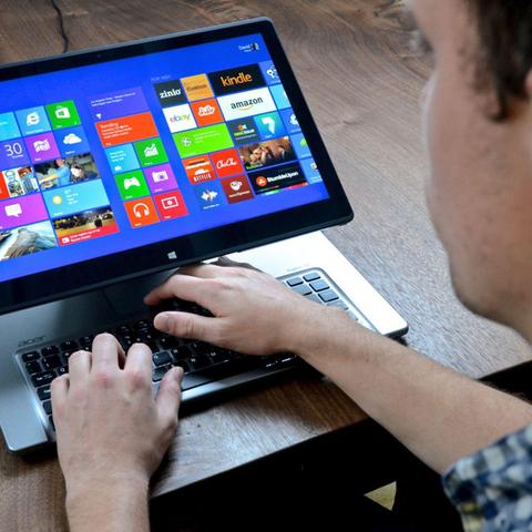
@MigaIsNotACat It looks like they put it there as the lesser of two evils when pulling the screen forward, so that you can still type, but this picture really demonstrates what a bad idea the whole thing is.
@vilmibm I love this! Aside from fridge magnet poetry with extremely limited sets of words, I haven't tried assembling poetry like this. For someone who struggles to write when faced with a blank page, I loved using this to dump a bunch of words out and extract a theme from them.
@henke It's very specific, but I'd avoid the 13" iPad Pro from 2018 (and maybe any that big). They're good at first for drawing, but, in both the original and the replacement I've had, I've ended up with a screen that is frequently unresponsive to touch and has a lot of light bleed on the edges.
@My_Kneecaps I can't speak to it subjectively, as I'm not among those groups, but the Web Content Accessibility Guidelines are a great resource for things like this. It looks like this isn't an appropriate amount of contrast, but not too far off! This tool can help you start to shift those colors to get the right amount of contrast, if that's what you're after: https://webaim.org/resources/contrastchecker/?fcolor=40468C&bcolor=C39C97