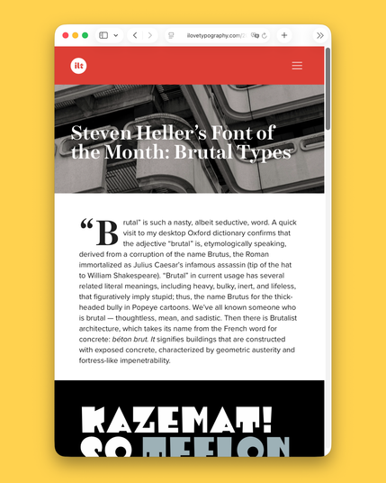
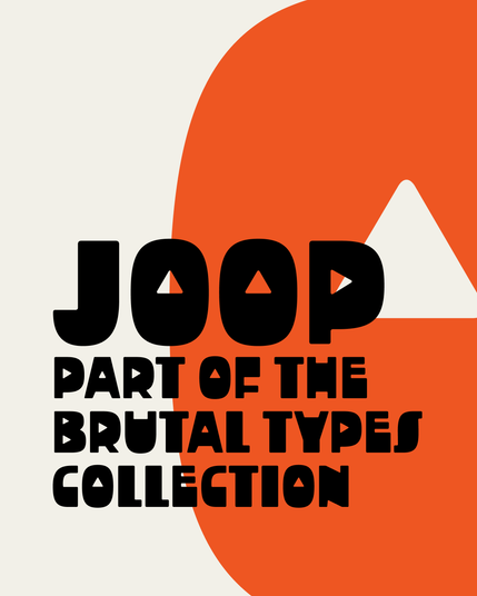
Steven Heller’s Font of the Month for June is the Brutal Types Collection: https://ilovetypography.com/2026/06/01/steven-hellers-font-of-the-month-brutal-types/

Love the modern shadowy numerals in ROHH’s Interlaken. Perfect for posters, book covers and for editorial design display.


Font of the Day:
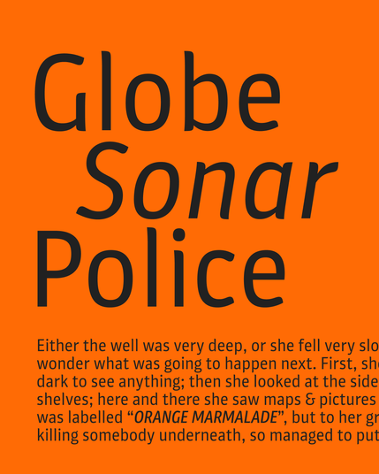
Plantago is a sans-serif design that shows delicate leaf-like stroke endings and subtle curves. The friendly look and variety of styles make it a versatile font for brands, packaging, or other mediums. The family has different widths from Condensed to Extended, totaling in no less than 36 styles.
https://fonts.ilovetypography.com/fonts/schriftlabor/plantago
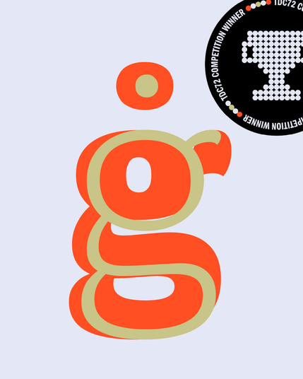
Congratulations to Laurent Bourcellier and Jonathan Fabreguettes on winning a TDC award for their beautiful typeface Almandin.
Get the award-winning Almandin (in static or variable fonts) here: https://fonts.ilovetypography.com/superfamily/Almandin
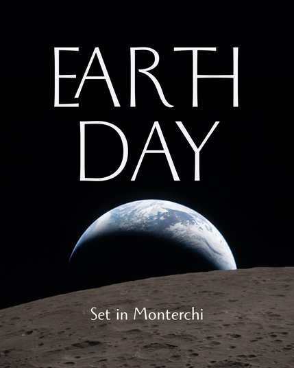
Happy Earth Day!
Let’s continue to look after it and defeat those who choose not to.
Photo: ‘Earthset’ captured on Flight Day 6 of the Artemis 2 mission to the moon. (Image credit: NASA)
Typeface: Monterchi by Zetafonts: https://fonts.ilovetypography.com/fonts/zetafonts/monterchi
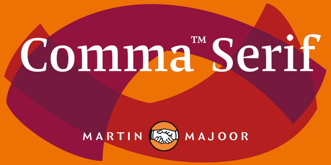
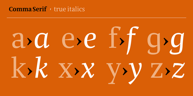
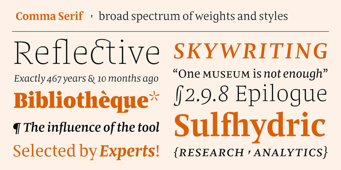
Very exciting news!
Today we release the third installment in Martin Majoor’s Comma superfamily trilogy. Meet the beautiful Comma Serif.
To celebrate its launch, for one time only, Comma Serif is a massive 75% off.
Grab the fonts here: https://fonts.ilovetypography.com/fonts/martin-majoor/comma-serif