Secret Panel HERE 😱 https://tapas.io/episode/3837607


I work on Stryker4s mutation testing for Scala. Love open source 👨💻, video games ⌨🖱, cats 🐱 and plants 🌱. I sometimes tweet Dutch stuff. He/him 🏳️🌈
If you want to make a universe, you must first bake a cake from scratch.
| GitHub | https://github.com/hugo-vrijswijk |
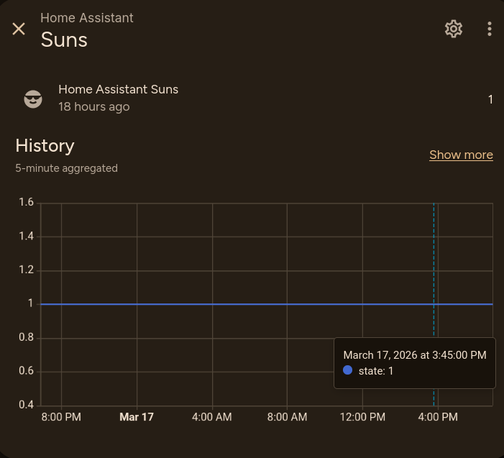
Computers are wild. Sometimes you encounter a bug so crazy that you don't even know where it could possibly come from.
If I boot up World of Warcraft on my Linux PC, the volume of my amplifier playing Spotify downstairs will (consistently!) be increased by about 10%


"Apple [UI design] took on an impossible task… And even if the premise was solid, I still wish I could say: they did the best they could, given the goal. But that’s not true either: they did a poor job consistently applying the metaphors and designing the icons themselves.”
https://tonsky.me/blog/tahoe-icons/
Yup. Tahoe's redesign, perfectly summarized: self-inflicted problems, executed poorly, contradicting their own stated principles.
Good riddance to its DRI. Fingers crossed for a better macOS 27.