This figure shows the pairwise hemagglutinin (HA) amino acid distance between each season’s H3N2 egg-passaged vaccine strain and a random sample of ~100-300 H3N2 strains circulating in the same season. Points show the median pairwise distance per season and error bars show the first and third quartile. The horizontal rule shows the average distance across all seasons. Northern Hemisphere seasons span from October 1 to April 1. Southern Hemisphere seasons span from April 1 to October 1.
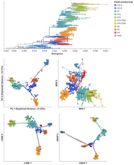
I’m proud to share a paper 5 years in the making on the application of dimensionality reduction methods to influenza and SARS-CoV-2 genomes (
https://doi.org/10.1093/ve/veae087). Sravani Nanduri led this project, starting as a rising junior in high school and a summer intern in 2019 in
@trvrb’s lab. Now a senior in the University of Washington’s Computer Science program, this is her first lead-author paper. For a high-level intro and link to the paper, check out our blog post:
https://bedford.io/blog/dimensionality-reduction-for-flu-and-sars-cov-2/
Dimensionality reduction distills complex evolutionary relationships in seasonal influenza and SARS-CoV-2
Abstract. Public health researchers and practitioners commonly infer phylogenies from viral genome sequences to understand transmission dynamics and identi
Most importantly, the measurements panel is an interactive visualization that is connected to the tree. When users zoom into the tree or color the tree by information about individual viruses, the measurements panel updates to show only those test viruses that are shown in the tree and color measurements for test viruses by the colors in the tree.
Users can toggle the display of averages and uncertainty to show individual measurements instead. This view shows how many measurements exist for each group of viruses, whether there are any patterns in those measurements that were hidden by the average values, and provides details about specific measurements when users hover over a point in the panel.
This is where the Nextstrain measurements panel comes in! The panel (right) redraws the same information shown in the heatmaps with average measurements (diamonds) for each potential vaccine viruses (rows) against recent virus groups (color). It also shows uncertainty of measurements (error bars), important distance cut offs (vertical lines), and the tree of recent viruses colored by group. Better potential vaccine viruses have diamonds closer to the vertical line at 0 for recent virus groups.
From dozens of choices, scientists have to pick a single vaccine virus that best represents the viruses that are circulating in the world now. The tree view shows what viruses are circulating now, but it only shows the experimental measurements for one potential vaccine virus at a time. Trevor and Richard complemented their tree view with a “heatmap” that shows the average distances (text and color) between recent groups of viruses (columns) and potential vaccine viruses (rows).
To this end,
@trvrb and
@richardneher created nextflu (
https://doi.org/10.1093/bioinformatics/btv381), a tool that draws the tree of how viruses are related and colors the tree by the distances between viruses that come from experimental measurements like those in the table shown above. Each “gear” below is a potential vaccine virus. Clicking a gear shows how different the surface of that virus appears to an immune system compared to other recent viruses (greater distance shows a greater difference).

nextflu: real-time tracking of seasonal influenza virus evolution in humans
Abstract. Summary: Seasonal influenza viruses evolve rapidly, allowing them to evade immunity in their human hosts and reinfect previously infected individuals.
For a long time, scientists compared virus measurements in tables like this (
https://www.pnas.org/doi/full/10.1073/pnas.1525578113). Each cell is one experiment where the column is the virus whose antibodies were used (the current vaccine virus or potential future vaccine viruses), the row is the virus that was tested with the antibodies, and the number is how diluted the antibodies were when they blocked the virus from attaching to the red blood cells (“1280” is 1 antibody in 1280 parts liquid).
Below, the small red dots show when antibodies against Virus A block each virus from attaching to cells. A small amount of antibodies against Virus A blocks Virus A, but Virus B and C require more antibodies against A to block them. The more antibodies against Virus A needed to block a virus, the more the shapes of Virus A and the other viruses differ. We can convert these amounts of antibodies into distances between pairs of viruses to measure how different they appear to an immune system.
Unfortunately, we don’t know which changes to virus genomes actually change the shape of the virus surface enough to need a new vaccine. We need lab experiments to measure the effects of genome changes on the virus surface. These experiments mix 1) antibodies that detect a specific virus (like the current vaccine), 2) red blood cells, and 3) a test virus. If antibodies attach to the virus, the virus can't attach to the cells, forming a pattern that can be seen by eye (
https://www.cdc.gov/flu/about/professionals/antigenic.htm).
Antigenic Characterization | CDC
How CDC uses antigenic characterization as part of global flu surveillance and to select viruses for use in the seasonal flu vaccine.