ios user interfaces have become truly nihilistic. buttons on top of buttons. text on top of text. multiple inscrutable hamburgers. nothing has any meaning and all human action is futile


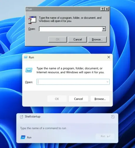
How UI degrades over time.
Top (Windows 95): great contrast, obvious shapes. Instantly readable.
Middle (Windows 11): shapes are still self-explanatory, but contrast is gone.
Bottom (Windows 11 Insiders): what am I even looking at? The only shape I can understand here is the Run button. Barely visible, though.
Then, on the left, there’s another something that says Run and has an icon. What is it? A window title? Another button? Why does it have to say Run twice?
... 1/3

Rubyists! tailwindcss-rails v3.0.0 is out, and it now relies on tailwindcss-ruby to package the tailwindcss executable.
https://github.com/rails/tailwindcss-rails/releases/tag/v3.0.0
This means you get to choose the version of tailwindcss that fits you best, even the new 4.0 alpha releases if you want!