Yesterday I introduced a lady to the Paperback app. She works in local government and receives a huge number of PDF's every week. She was thrilled with it. https://paperback.dev/downloads/
Dominique Gilchrist
@dom_g
- 66 Followers
- 95 Following
- 279 Posts
still new to this whole mastidon thing, I'm Dominique, but most people call me dom. I'm into tech, true crime shows and video games 33, totally blind, and from north Carolina.
Yo yo hi all
Alpha Release: FastGH, a Desktop Client for Interacting with GitHub; for Windows and Mac https://groups.io/g/tech-vi/message/11102
Happy belated new year all!! So I saw on apple viss that there is Mona 7 for Mastodon, is it worth upgrading to? I don’t like that you have to pay for the product again.
woe is mona not refreshing! Have not been on here in about 2 or so months.
yo yo!! Have not been on here in a while. How's everyone doing?
Super bored!! What's up? Have not been on here in a while.
Hey all, have not been here in it seems like a while. How is everyone doing?
Hip hop legend Jeezy takes 10-hour Uber ride to make it to own concert after transit nightmare
Source: New York Post https://share.newsbreak.com/egtb55t5?s=i0
Source: New York Post https://share.newsbreak.com/egtb55t5?s=i0

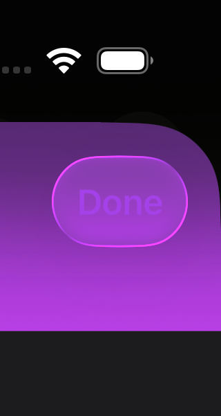
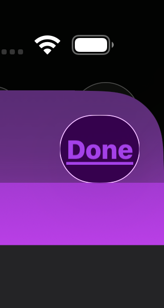
I'm a huge advocate for making apps accessible, but I find myself saying "fuck it" when dealing with Liquid Glass.
It's not possible to maintain contrast across a range of app content with a text label that's non-deterministic. When someone who's empathetic to the needs of others gives up, it's a huge loss.
Apple has a well earned reputation for accessibility and Alan Dye is fucking that up for a lot of folks who need affordances.
We should not be choosing between the lesser of two evils.