God, this bubble burst is going to be so brutal

| Website | https://cdf1982.com |
| GlanceCam | https://www.glancecam.app |
| Milla's Insta | https://www.instagram.com/millakillapilla/ |
Yeah, bad UIs are never fault of #SwiftUI, which I actually used with satisfaction to build pretty complex interfaces in clients’ apps.
So it was entirely avoidable to make awful things like System Settings or #Xcode 26 new settings pane. https://chaos.social/@dasdom/114709047005711802
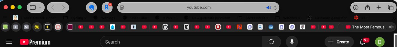
This is what Apple think looks good on macOS. (This is simply the top of Safari playing a YouTube video in "Theatre" mode.)
Liquid (gl)ass indeed.
To be clear - this on macOS. Things look better on iOS and iPadOS, for the most part. But I think this theme concept, and execution, is absolutely awful on things you don't "touch". Consolidating the look across utterly different interaction and display models makes no damn sense.
It's like MS making Pocket PC look like Windows...which they did.