Been feeling a little confident about your abilities as a developer? Try learning shaders, it'll knock you down a couple of pegs.
Spent nearly a week only on shaders and it's starting to click.
Here's some Perlin noise converted to ascii

| Website | https://andri.co/ |
| Component Odyssey | https://component-odyssey.com/ |
| https://twitter.com/andricokaroulla | |
| a2000 | https://a2000.netlify.app/ |
Been feeling a little confident about your abilities as a developer? Try learning shaders, it'll knock you down a couple of pegs.
Spent nearly a week only on shaders and it's starting to click.
Here's some Perlin noise converted to ascii
I've never messed with sites that reveal text on scroll. I understand the case for images, but text less so.
Does anyone stand by them?
Thanks to @kizu 's article, I managed to remove the JavaScript for this "fill text" effect, and instead rely only on CSS
The Chrome flamegraphs show an improvement to performance as well
Registered custom properties are now available in all modern browsers. Using some pre-existing techniques based on them and complex container query length units, I solved a years-long problem of fitting text to the width of a container, hopefully paving the path towards a proper native implementation.
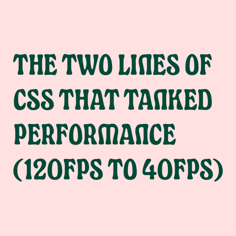
When I built Learn WCs, I disabled animations on Firefox because the frame rate was so bad.
Turns out it was due to 2 CSS properties 👀
https://component-odyssey.com/articles/13-improving-performance-by-changing-two-lines-of-css
🏍️ The Two Lines of CSS That Tanked Performance (120fps to 40fps)
by Andrico X: @andricokaroulla @andrico
#webperf #performance #css #webdev
https://component-odyssey.com/articles/13-improving-performance-by-changing-two-lines-of-css
I did another round of testing on the Learn WCs site, including going more in-depth with a screen. I learnt a ton, like:
- when to hide decorative content
- when to create screen reader only content
- quirks between screen readers and browsers
- choosing HTML over ARIA to provide state information
I wrote up everything I learned here:
https://component-odyssey.com/articles/12-improving-the-screen-reader-experience-for-learn-wcs
I'm also not sure whether to make the right content a polite alert to alert screen reader users on change. Maybe landmarks to indicate that left content affects right content is less aggro.
aria-controls looks handy, but the left content would be inside shadow DOM


