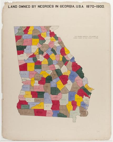
#DuboisChallenge2026 Week 6: and Owned by Negroes in Georgia, USA, 1870-1900.
This choropleth map tracks the acres of land owned by Black people in Georgia, over thirty years, by county. The acreage ranges from 44,601 in Liberty County, to 130 acres in Fannin county.
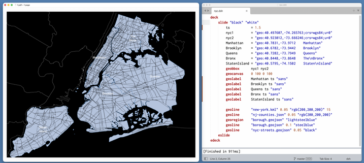
NYC streets (with decksh source)
For
#DuboisChallenge2026 week 5: The migration to and from Georgia to other the states of the US is shown in this visual. The map shows how the state with a large Black population originated, and where they were dispersed to.
#DuboisChallenge2026, week 4: "Negro Population of Georgia by County", is a choropleth map with a alternating left-right pattern, comparing the population of Black
Georgians in the years 1870 and 1890. Note the decrease of lightly
populated areas, with the heavily populated areas in red shifting west.
#DuboisChallenge2026, week 3: This chart shows the Black population in the Georgia counties ranges from over 30,000 in the south east to under 1000 in the north and southern portions of the state. The most prevalent category is in the 5-10,000 Black people distributed throughout the state.
For week 2 of the
#DuboisChallenge2026: This map of the US shows the distribution of Black people at the turn of the twentieth century. Ranging from 75,000 and over in Georgia to less than 10,000 in the western states.
This chart shows the proportion of Blacks in total population of the US is compared from 1800 (one-fifth, 20%) to 1890 (one-eighth, 12.5%) The sizes are shown as superimposed maps: a land within another land.
This chart of small multiples, compares the population of Blacks in America with various countries (Spain, Australia, Norway/Sweden, Belgium, the Netherlands, Switzerland, Hungary, Bavaria, and England).
Yet another way to the distribution of Black people in America, this chart uses number of people per square mile, ranging from 15-15 in southern states like Georgia and Mississippi, to less than 1 person/square mile in the west and upper mid-west.
Serving as the introductory display, this chart shows the full Du Bois color palette. The chart includes bi-lingual text, a map of the Black population in the US, and a familiar pie chart showing professions in the population.