We have a dream team 😃, organising the Visualising Climate conference together (https://visualisingclimate.com Bologna, 4–6 November 2026). Including Anna Lombardi, Diana Urquiza, and Alberto Cairo @albertocairo


The first global conference on how data visualisation can support understanding and decision-making on climate change.
𝗕𝗼𝗹𝗼𝗴𝗻𝗮, 𝗜𝘁𝗮𝗹𝘆
4–6 November 2026
Website: https://visualisingclimate.com


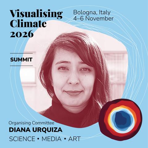
Our conference logo was designed by Dr. Anna Lombardi, Climate Data Visualiser at the Copernicus Climate Change Service @CopernicusEU. Her aim: to create an image that sparks curiosity and gently invites people in.
The raw data for this visualisation is a set of monthly global temperatures. Through annual cycles that move from blue to red, the visualisation reveals the steady rise in global temperatures from the 1980s to recent years.

Visualising Climate 2026 is the first global conference dedicated to data visualisation and climate change.
Bologna, Italy, 4–6 November 2026
WHY bring science, media, design and art together?
Because they are powerful tools to understand complexity, engage broader audiences, and bring science closer to people. Beauty and clarity can open space for dialogue and support informed decisions.
📢 Call for contributions
⏰ Deadline: 30 Apr 2026
👉 Info: https://visualisingclimate.com

Join us in Bologna, Italy, from 4 to 6 November 2026 for Visualising Climate – the first global conference dedicated to data visualisation and the climate crisis.
https://visualisingclimate.com
In this era of an accelerating climate crisis, the role of clear, compelling and actionable communication has never been more critical.
Together, scientists, artists, designers, communicators, and journalists will explore the space where data meets storytelling, and art meets science.
