EuroVis

@EuroVis@vis.social
68 Followers
0 Following
63 Posts
Eurographics Conference on Visualization
Websitehttps://eurovis.org
#Eurovis2023 ends with the invitation to Odense next year. Thank you for being here and we look forward to seeing you again next year. Have a good trip home!
We are already there and start with the preprogram of #Eurovis2023. If you can't wait any longer, you can already have a look at the paper that we have linked to you in the program: https://conferences.eg.org/eurovis2023/for-attendees/program/
Program – EuroVis 2023

📜 Interested in how VA supports Explainability for DL models (and avoids AGI prevails on humans ;-))?
✍️ B. La Rosa, G. Blasilli, R. Bourqui, D. Auber, G. Santucci, R. Capobianco, E. Bertini, R. Giot, and M. Angelini
👉 paper: https://doi.org/10.1111/cgf.14733, website: https://aware-diag-sapienza.github.io/VA4XDL
#STAR #EuroVis #Eurovis2023
📜 We compared three event sequence visualization tools via a insight-based crowdsourced study.
✍️ Kazi Tasnim Zinat, Jinhua Yang, Arjun Gandhi, Nistha Mitra, Zhicheng Liu
👉 http://arxiv.org/abs/2306.02489
#Fullpaper #EuroVis #Eurovis2023
A Comparative Evaluation of Visual Summarization Techniques for Event Sequences

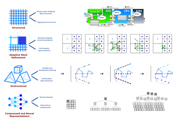
Real-world event sequences are often complex and heterogeneous, making it difficult to create meaningful visualizations using simple data aggregation and visual encoding techniques. Consequently, visualization researchers have developed numerous visual summarization techniques to generate concise overviews of sequential data. These techniques vary widely in terms of summary structures and contents, and currently there is a knowledge gap in understanding the effectiveness of these techniques. In this work, we present the design and results of an insight-based crowdsourcing experiment evaluating three existing visual summarization techniques: CoreFlow, SentenTree, and Sequence Synopsis. We compare the visual summaries generated by these techniques across three tasks, on six datasets, at six levels of granularity. We analyze the effects of these variables on summary quality as rated by participants and completion time of the experiment tasks. Our analysis shows that Sequence Synopsis produces the highest-quality visual summaries for all three tasks, but understanding Sequence Synopsis results also takes the longest time. We also find that the participants evaluate visual summary quality based on two aspects: content and interpretability. We discuss the implications of our findings on developing and evaluating new visual summarization techniques.

arXiv.org
📜 GO-Compass: How can we compare lists of apples and oranges, or more specifically, lists of GO terms?
✍️ Theresa Harbig, Mathias Witte-Paz, Kay Nieselt
👉 https://tuevis.cs.uni-tuebingen.de/go-compass/
#Fullpaper #EuroVis #Eurovis2023
GO-Compass – TueVis

📜 A review and classification of large-scale visualization methods for struct/unstruct/AMR volume data
✍️ Jonathan Sarton, Stefan Zellmann, Serkan Demirci, Ugur Gudukbay, Welcome Alexandre-Barff, Laurent Lucas, Jean-Michel Dischler, Stefan Wesner, and Ingo Wald
#STAR #EuroVis #Eurovis2023
📜 Unfolding Edges is an interactive approach for in-situ exploration of multivariate edge attributes.
✍️ @markjan @nrchtct & C. Tominski
👉 https://uclab.fh-potsdam.de/unfoldingedges/ 
#Fullpaper #EuroVis #Eurovis2023
Unfolding Edges

📜 Try out RectEuler: An interactive tool to visualize intersecting sets using rectangles!
✍️  Patrick Paetzold, Rebecca Kehlbeck, Hendrik Strobelt, Yumeng Xue, Sabine Storandt, and Oliver Deussen
👉 www.rectvis.de
#Fullpaper #EuroVis #Eurovis2023
📜 ParaDime makes it easy to use neural networks for dimensionality reduction
✍️  Andreas Hinterreiter, @chumer, @BernhardKainz, @marcstreit
👉 https://paradime.readthedocs.io
#Fullpaper #EuroVis #Eurovis2023
ParaDime: A Framework for Parametric Dimensionality Reduction — paradime 1.1.0 documentation

📜 TGVE: a tool for analysis and visualization of geospatial data.
✍️ Layik Hama, Roger Beecham, and Nik Lomax
👉 github.com/tgve
#Shortpaper #EuroVis #Eurovis2023