 Alice
Alice 
i got bored again
/* Generic */
.top-bar, .bottom-bar {
background-image: linear-gradient(to bottom, rgb(255 255 255 / 20%), rgb(0 0 0 / 15%));
background-color: var(--accent-bg-color);
box-shadow: inset 0 1px rgb(255 255 255 / 25%), inset 0 -1px rgb(0 0 0 / 15%);
color: white;
text-shadow: 0 -1px rgb(0 0 0 / 40%);
-gtk-icon-shadow: 0 -1px rgb(0 0 0 / 40%);
--button-bg-color: var(--accent-bg-color);
--button-bg-gradient: linear-gradient(to bottom, rgb(255 255 255 / 25%), rgb(0 0 0 / 15%));
}
.top-bar > windowhandle {
box-shadow: 0 0 5px 2px rgb(0 0 0 / 30%);
}
.bottom-bar {
background-color: #3D3846;
--button-bg-color: #3D3846;
}
.top-bar button, .bottom-bar button {
background-color: var(--button-bg-color);
background-image: var(--button-bg-gradient);
box-shadow: inset 0 0 2px 1px rgb(0 0 0 / 15%), inset 0 1px rgb(0 0 0 / 40%), 0 1px rgb(255 255 255 / 20%);
border-radius: 6px;
text-shadow: 0 -1px rgb(0 0 0 / 40%);
-gtk-icon-shadow: 0 -1px rgb(0 0 0 / 40%);
color: white;
}
entry {
background: white;
color: black;
text-shadow: none;
-gtk-icon-shadow: none;
box-shadow: inset 0 0 2px 1px rgb(0 0 0 / 45%);
border-radius: 9999px;
}
button.destructive-action {
--button-bg-color: var(--destructive-bg-color);
color: white;
}
button.suggested-action {
--button-bg-color: var(--accent-bg-color);
color: white;
}
.boxed-list, .card, .boxed-list-separate row {
background: white;
color: black;
box-shadow: inset 0 0 0 1px rgb(0 0 0 / 30%), inset 0 1px rgb(0 0 0 / 20%), 0 1px rgb(255 255 255 / 40%);
text-shadow: none;
-gtk-icon-shadow: none;
}
toolbarview {
--color1: oklch(from var(--accent-bg-color) 86% 3% h);
--color2: oklch(from var(--accent-bg-color) 84% 3% h);
background: repeating-linear-gradient(to right, var(--color1), var(--color1) 8px, var(--color2) 8px, var(--color2) 12px);
text-shadow: 0 1px rgb(255 255 255 / 50%);
-gtk-icon-shadow: 0 1px rgb(255 255 255 / 50%);
}
:root {
--card-shade-color: rgb(0 0 0 / 20%);
}
row .icon {
min-width: 32px;
min-height: 32px;
padding: 0;
margin-top: 6px;
margin-bottom: 6px;
background: var(--accent-bg-color);
color: white;
border-radius: 6px;
box-shadow: inset 0 0 0 1px rgb(0 0 0 / 50%), inset 0 0 0 2px rgb(255 255 255 / 10%);
background-image: radial-gradient(ellipse 200% at 50% -50%, white, rgba(255 255 255 / 20%) 50%, rgba(0 0 0 / 20%) 50%, transparent 65%);
-gtk-icon-shadow: 0 0 2px rgb(0 0 0 / 40%);
}
.boxed-list row .icon {
min-width: 32px;
min-height: 32px;
padding: 0;
margin-top: 9px;
margin-bottom: 9px;
}
.top-bar windowcontrols button {
background: none;
box-shadow: none;
}
.top-bar windowcontrols button image {
background-color: black;
background-image: radial-gradient(ellipse 200% at 50% -50%, white, rgba(255 255 255 / 20%) 50%, rgba(0 0 0 / 20%) 50%, transparent 65%);
box-shadow: none;
box-shadow: inset 0 0 0 2px white, 0 2px 3px 1px rgb(0 0 0 / 30%);
-gtk-icon-shadow: 0 0 2px rgb(0 0 0 / 40%);
}
sheet {
box-shadow: inset 0 0 0 3px rgba(255 255 255 / 80%), 0 0 2px rgba(0 0 0 / 40%), 0 5px 8px 2px rgb(0 0 0 / 40%);
}
bottom-sheet > sheet .top-bar {
box-shadow: inset 0 -1px rgb(0 0 0 / 15%);
}
bottom-sheet > sheet,
bottom-sheet > sheet > outline,
bottom-sheet > sheet > stack > widget,
bottom-sheet > sheet > stack > button,
bottom-sheet > sheet > stack > button > widget {
border-top-left-radius: 12`px;
border-top-right-radius: 12px;
}
bottom-sheet > sheet > outline {
box-shadow: inset 0 1px rgb(255 255 255 / 25%);
}
row .title {
font-weight: bold;
}
dialog.alert sheet {
box-shadow: inset 0 0 0 3px rgba(255 255 255 / 80%), 0 0 2px rgba(0 0 0 / 40%), 0 5px 8px 2px rgb(0 0 0 / 40%);
background-color: color-mix(in srgb, var(--accent-bg-color) 90%, transparent);
background-image: radial-gradient(ellipse 500% at 50% -235%, rgba(255 255 255 / 20%) 48%, rgba(255 255 255 / 0%) 50%, rgba(0 0 0 / 30%) 50%);
color: white;
text-shadow: 0 -1px rgb(0 0 0 / 40%);
-gtk-icon-shadow: 0 -1px rgb(0 0 0 / 40%);
}
dialog.alert button {
background-color: var(--button-bg-color);
background-image: linear-gradient(to bottom, rgb(255 255 255 / 25%), rgb(255 255 255 / 5%) 50%, rgb(0 0 0 / 15%) 50%, rgb(0 0 0 / 5%));
box-shadow: inset 0 0 0 1px rgb(255 255 255 / 15%), 0 1px rgb(255 255 255 / 25%);
border: 1px solid rgb(0 0 0 / 50%);
border-radius: 6px;
text-shadow: 0 -1px rgb(0 0 0 / 40%);
-gtk-icon-shadow: 0 -1px rgb(0 0 0 / 40%);
color: white;
font-size: 130%;
}
.navigation-sidebar {
padding: 0;
}
.navigation-sidebar row {
margin: 0;
border-radius: 0;
margin-top: 2px;
box-shadow: 0 -2px rgb(0 0 0 / 10%), 0 -1px rgb(255 255 255 / 60%);
}
.navigation-sidebar row:first-child {
box-shadow: none;
margin-top: 0;
}
.navigation-sidebar row:selected {
color: white;
background-color: var(--accent-bg-color);
background-image: linear-gradient(to bottom, rgb(255 255 255 / 20%), rgb(0 0 0 / 15%));
text-shadow: 0 -1px rgb(0 0 0 / 40%);
-gtk-icon-shadow: 0 -1px rgb(0 0 0 / 40%);
}
.navigation-sidebar .header separator {
background: none;
}
.sidebar-pane {
border-right: 1px solid rgb(0 0 0 / 50%);
}
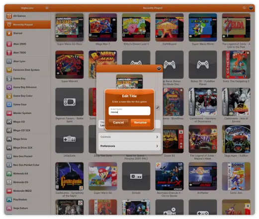
/* Highscore */
.library sidebar row:nth-child(4) .icon,
.library sidebar row:nth-child(5) .icon,
.library sidebar row:nth-child(12) .icon,
.library sidebar row:nth-child(21) .icon,
.library sidebar row:nth-child(28) .icon {
background-color: var(--accent-red);
}
.library sidebar row:nth-child(9) .icon,
.library sidebar row:nth-child(25) .icon {
background-color: var(--accent-purple);
}
.library sidebar row:nth-child(7) .icon,
.library sidebar row:nth-child(10) .icon,
.library sidebar row:nth-child(26) .icon,
.library sidebar row:nth-child(27) .icon {
background-color: var(--accent-yellow);
}
.library sidebar row:nth-child(11) .icon,
.library sidebar row:nth-child(24) .icon {
background-color: var(--accent-blue);
}
.library sidebar row:nth-child(13) .icon,
.library sidebar row:nth-child(14) .icon,
.library sidebar row:nth-child(15) .icon,
.library sidebar row:nth-child(16) .icon {
background-color: var(--dark-2);
}
.library sidebar row:nth-child(6) .icon,
.library sidebar row:nth-child(8) .icon,
.library sidebar row:nth-child(17) .icon,
.library sidebar row:nth-child(18) .icon {
background-color: var(--accent-slate);
}
.library sidebar row:nth-child(20) .icon {
background-color: var(--light-5);
}
.library sidebar row:nth-child(22) .icon {
background-color: var(--accent-teal);
}
.library sidebar row:nth-child(29) .icon,
.library sidebar row:nth-child(30) .icon {
background-color: var(--accent-orange);
}
.library sidebar row:nth-child(23) .icon {
background-color: var(--accent-pink);
}
.library sidebar row:nth-child(19) .icon {
background-color: var(--accent-green);
}
.display .top-bar {
background-color: rgb(30 30 34 / 50%);
background-image: linear-gradient(to bottom, rgb(255 255 255 / 10%), rgb(255 255 255 / 5%) 50%, rgb(0 0 0 / 20%) 50%, rgb(0 0 0 / 15%));
--button-bg-color: #111115;
--button-bg-gradient: linear-gradient(to bottom, rgb(255 255 255 / 15%), rgb(255 255 255 / 05%) 50%, rgb(0 0 0 / 15%) 25%, rgb(0 0 0 / 10%));
box-shadow: inset 0 1px rgb(255 255 255 / 10%);
}
button.card {
box-shadow: inset 0 0 0 1px rgba(255 255 255 / 10%), 0 0 2px rgba(0 0 0 / 80%), 0 5px 8px 2px rgb(0 0 0 / 60%);
background-color: rgb(30 30 34 / 50%);
background-image: radial-gradient(ellipse 500% at 50% -215%, rgba(255 255 255 / 20%) 42%, rgba(255 255 255 / 0%) 50%, rgba(0 0 0 / 30%) 50%);
color: white;
text-shadow: 0 -1px rgb(0 0 0 / 40%);
-gtk-icon-shadow: 0 -1px rgb(0 0 0 / 40%);
}
game-cover {
box-shadow: 0 1px rgb(255 255 255 / 40%);
}
game-cover .empty {
background: #555556;
color: rgb(255 255 255 / 80%);
-gtk-icon-shadow: 0 0 10px rgb(0 0 0 / 40%);
}
game-cover .sheen {
border-radius: 12px;
box-shadow: inset 0 0 0 1px rgb(0 0 0 / 50%), inset 0 0 0 2px rgb(255 255 255 / 20%);
background-image: radial-gradient(ellipse 400% at 50% -150%, rgb(255 255 255 / 10%), rgba(255 255 255 / 5%) 50%, rgba(0 0 0 / 10%) 50%, transparent 65%);
}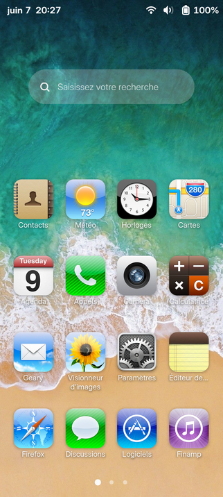
@alice Yeah I think it's 7, 6 had another beach one, but I really like this one too, I've found all wallpaper for iOS 6 and put them in my repo, there ! https://gitlab.com/Krafting/igtk-theme/-/tree/main/images/wallpapers?ref_type=heads
The fish is there too ! :)
Edit: It's 11.jpg
 Krafting
 [Nima@NimaOS ~]#
 Jonas
Jonas Mat
Mat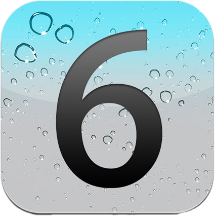
 Steven Deobald