How Supertramp’s 'Breakfast in America' Album Cover Was Created
📰 Original title: The Story Behind the Album Cover for Supertramp’s 1979 Masterpiece “Breakfast in America”
🤖 IA: It's not clickbait ✅
👥 Users: It's not clickbait ✅
View full AI summary: https://en.killbait.com/how-supertramp-s-breakfast-in-america-album-cover-was-created.html?utm_source=mastodon_social&utm_medium=social&utm_campaign=killbait.mastodon_social
How Supertramp’s 'Breakfast in America' Album Cover Was Created
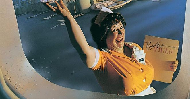
Supertramp's 1979 album 'Breakfast in America' features one of the most inventive and iconic album covers of the 1970s. Designed to resemble a view of Lower Manhattan from an airplane window, the cover creatively uses everyday breakfast and diner items to construct the skyline. Actress and model Kate Murtagh portrays 'Libby,' a cheerful waitress standing in for the Statue of Liberty, holding orange juice as a torch and a menu as the tablet. The concept was developed by art director Mike Doud, designed by Mick Haggerty, and photographed by Aaron Rapoport. The back cover complements the front, showing the band enjoying breakfast in a real diner while being served by Libby, reinforcing the album’s playful take on American culture. The design earned Mike Doud a Grammy for Best Recording Package in 1980. Despite later conspiracy theories connecting the cover to the events of 9/11, the band and designers have clarified that any perceived resemblance was purely coincidental. The cover remains celebrated for its humor, creativity, and clever commentary on British perspectives of American life.