 Michael W Lucas
Hey #wordpress folks! I'm stumped.
My web site has shows book covers for everything I've written or appeared in. The images are have "align=alignleft".
Most pages, this is fine.
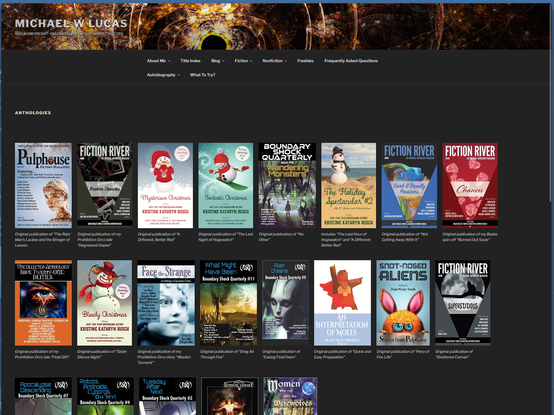
On a couple, though, as you widen the page, certain pics appear on the far right on short rows. It's like there's a hard line break somewhere? https://mwl.io/fiction/anthologies is an example.
I'd rather have nice tidy rows. Any suggestions what I should look at? Or the search terms I need to use?
 Annika Backstrom
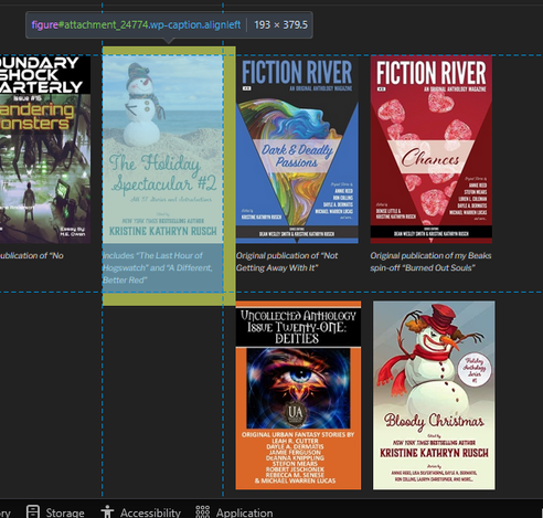
 threadi
 Tim Chase
 Chris Hayes