Linux mascot Tux the penguin hits 30 years old — Linus Torvalds outlined the design of the 'slightly overweight penguin' on May 9, 1996

I really wish Linux would drop it with the animal mascots thing, it so dated. Most everything else moved away from the concept when the 90s ended.
How else would we have characters for SuperTuxKart?
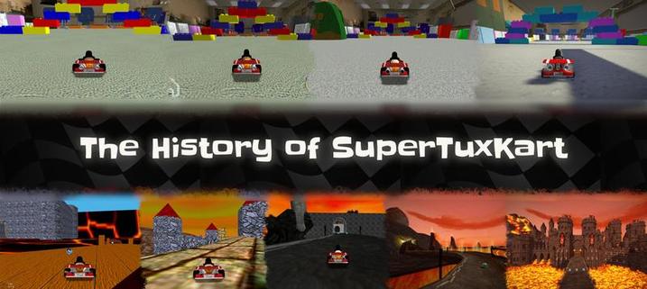
SuperTuxKart
SuperTuxKart Evolution The next major release of SuperTuxKart, named SuperTuxKart Evolution is currently under development. Building upon the foundation laid by all those who made STK what it is today, SuperTuxKart Evolution will be the biggest release in STK’s history in terms of new content: new tracks, new features, improved gameplay, enhanced graphics, and much more. An overview of our roadmap is available here.
Eh, it’s ok. And not as pervasive as you imply. Isn’t one of them a hat? And another a plant? And another three people holding hands?
I remember when Mac OS stopped using animal mascots back right after the 90s ended… in 2012.
Nah, the Penguin is iconic at this point. Tux IS Linux!
had to be overweight like it had eaten a bucketful of herring, as the only other kind of happy penguin is one that has ‘just gotten laid,’
Honestly I think Tux still looks more like he’s just gotten laid rather than full from eating but that’s just me.
Will I be hated and insulted if I say I never liked it much?
Oh 9!
Generic insult!
It definitely needs a more artistic touch. I feel like it differs from the open source dullness.
No hate for FOSS, but many of its brandings could use some more expressive color pallettes and dynamic designs. Tux is literally a black & white penguin sitting around. Lol
Erm actually… it is comprised of ‘black’ ‘white’ and ‘yellow’ wich appears in the ‘beak’ inhales mucus i use Arch gnu/linux btw.