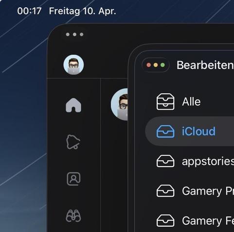
Recently (iPadOS 26.4?) Apple added a stroke border to windows to help them stand out when layered on top of each other. macOS had this for years, but iOS was always focused on the pure approach when it comes to outlines on things and was mostly flat.
It lowkey looks ugly, but I guess it helps. Previously it could be hard to tell where one window starts and where the other ends, more so in dark mode.