Home
Explore
mastodon.social
mstdn.social
infosec.exchange
mstdn.jp
social.vivaldi.net
hachyderm.io
piaille.fr
mastodon.world
troet.cafe
m.cmx.im
mastodon.uno
mastodon.gamedev.place
techhub.social
social.tchncs.de
mastodon.nl
norden.social
flipboard.social
kolektiva.social
mastoturk.org
mathstodon.xyz
nrw.social
occm.cc
tech.lgbt
defcon.social
mastodonapp.uk
mstdn.ca
universeodon.com
c.im
masto.es
sueden.social
mstdn.party
toot.community
mastodon.sdf.org
sfba.social
mastodon.scot
tkz.one
mastodon.ie
ohai.social
ruhr.social
mastodontech.de
hessen.social
pouet.chapril.org
mastodon.nu
livellosegreto.it
mastodon.au
ieji.de
muenchen.social
social.linux.pizza
indieweb.social
mastodon.bida.im
social.cologne
mastodon.eus
ioc.exchange
mastodon.green
mastodont.cat
wehavecookies.social
social.anoxinon.de
feuerwehr.social
nerdculture.de
mindly.social
ruby.social
masto.nu
mastodon.ml
cyberplace.social
metalhead.club
m.otter.homes
dresden.network
phpc.social
uri.life
mastodontti.fi
toot.wales
sunny.garden
climatejustice.social
sciences.social
noc.social
mstdn.plus
freiburg.social
tooting.ch
blorbo.social
mastodon.me.uk
privacysafe.social
furry.engineer
rollenspiel.social
hostux.social
mastodon.com.pl
woof.tech
bonn.social
urbanists.social
mast.lat
mastoart.social
gaygeek.social
rheinneckar.social
rivals.space
ursal.zone
mapstodon.space
wien.rocks
mstdn.games
h4.io
fairy.id
expressional.social
discuss.systems
masto.pt
mastodon-belgium.be
todon.nl
hcommons.social
bark.lgbt
snabelen.no
cupoftea.social
sakurajima.moe
darmstadt.social
lgbtqia.space
tilde.zone
shelter.moe
mastodon.gal
retro.pizza
glasgow.social
urusai.social
ludosphere.fr
muenster.im
qdon.space
mastodon.berlin
socel.net
pawb.fun
peoplemaking.games
toot.aquilenet.fr
mast.dragon-fly.club
union.place
freeradical.zone
veganism.social
kanoa.de
bookstodon.com
mstdn.dk
vmst.io
famichiki.jp
eupolicy.social
theblower.au
witter.cz
machteburch.social
oslo.town
toad.social
masto.nyc
xarxa.cloud
mastodon.uy
tooot.im
fandom.ink
stranger.social
musicworld.social
disabled.social
thecanadian.social
mstdn.business
gardenstate.social
burningboard.net
cultur.social
hear-me.social
pnw.zone
graphics.social
mountains.social
furries.club
mustard.blog
mastorol.es
mastodon.pnpde.social
musician.social
dizl.de
ciberlandia.pt
bahn.social
archaeo.social
toot.kif.rocks
fedi.at
tea.codes
tuiter.rocks
libretooth.gr
babka.social
musicians.today
vkl.world
4bear.com
dmv.community
mastodon.energy
ani.work
frikiverse.zone
drupal.community
tyrol.social
masto.nobigtech.es
gamepad.club
qaf.men
mast.hpc.social
social.seattle.wa.us
fulda.social
lou.lt
donphan.social
toot.si
tchafia.be
social.politicaconciencia.org
is.nota.live
muri.network
hometech.social
bzh.social
social.silicon.moe
puntarella.party
mograph.social
norcal.social
datasci.social
wargamers.social
lsbt.me
mastodon.vlaanderen
opencoaster.net
toot.funami.tech
mastodon.africa
theatl.social
hispagatos.space
toot.re
epicure.social
burma.social
est.social
elekk.xyz
leipzig.town
mastodon.london
lewacki.space
genealysis.social
kurry.social
apobangpo.space
mastodon.pirateparty.be
toot.garden
mastodon.education
planetearth.social
friendsofdesoto.social
mastodon.cr
mstdn.animexx.de
devianze.city
indieauthors.social
esq.social
colorid.es
ruhrpott.social
hoosier.social
mastodon.wien
mastodon.bot
techtoots.com
toots.nu
mastodon-swiss.org
frontrange.co
opalstack.social
fribygda.no
library.love
h-net.social
paktodon.asia
raphus.social
fairmove.net
poweredbygay.social
rheinhessen.social
mastodon.sg
rail.chat
cwb.social
seocommunity.social
arvr.social
mastodon.free-solutions.org
epsilon.social
episcodon.net
camp.smolnet.org
stereodon.social
mastodon.cipherbliss.com
bologna.one
masto.yttrx.com
okla.social
elizur.me
biplus.social
growers.social
birdon.social
k8s.social
mastodon.hosnet.fr
skastodon.com
squawk.mytransponder.com
khiar.net
mastodon.babb.no
mastodon.frl
cville.online
lounge.town
silversword.online
social.diva.exchange
balkan.fedive.rs
kcmo.social
ailbhean.co-shaoghal.net
mastodon.iow.social
mastodon.bachgau.social
kzoo.to
23.illuminati.org
mastodon.ph
synapse.cafe
mcr.wtf
nfld.me
mastodon.bahia.no
voi.social
social.ferrocarril.net
darticulate.com
mastodon.ee
nautical.social
troet.fediverse.at
social.sndevs.com
mastodon.mg
fpl.social
polsci.social
dariox.club
ms.maritime.social
nomanssky.social
mikumikudance.cloud
bvb.social
kjas.no
nutmeg.social
ceilidh.online
netsphere.one
wxw.moe
learningdisability.social
computerfairi.es
Log In
dan
2d ago
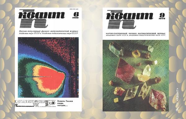
the design on these was so awesome
2
1
0
Show thread
Open Risk
2d ago
The Cyrillic font could use some work though to match the target aesthetic?
0
0
0
Show thread
dan
it kind of sets the aesthetic, no?
0
0
0
Show thread
Open Risk
2d ago
dunno, without decorative serifs and slanting the outcome would be more coherent methinks. Matching the purity of the main window.
0
0
0
Show thread
Open Risk
2d ago
like the subtitles on the right example are midway there...
0
0
0