Show HN: Orange Juice – Small UX improvements that make HN easier to read
I made a Stylus style to make Hacker News's UI more modern.
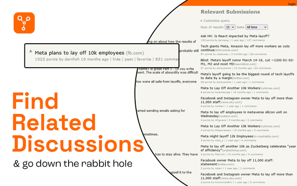
Some screenshots:
https://gist.github.com/user-attachments/assets/643969af-89c...
https://gist.github.com/user-attachments/assets/95e4b14d-b67...
Did you ai generate the Chrome and Firefox logo? That isn't what they look like, or have ever looked like, from what I know.
…why?
I'd rather focus on building features vs. caring about logos.
Update: I'm having AI fix this since you guys want to focus so hard on it. Of all things... lol.
> Why Install Orange Juice?
> Because Hacker News is great, but repetitive UI friction adds up. Orange Juice keeps the original feel while removing the things that cost you time every day.
That does not convince me to use your app? This is like calling someone's Kia shit and instead telling them to buy a Tesla, but just stating that it's better.
I'll stick to HN, thanks.
"Tested, not vibe coded" yet you mention the AI has written all the tests. This extension may not be vibe coded but it's close to that, it seems. Regardless it seems to work well, I replaced the older Refined Hacker News extension with this, which seems like where you initially sourced the code from as the features are very similar, 1:1 even for some.
I also use this extension HNRelevant (https://addons.mozilla.org/en-US/firefox/addon/hnrelevant) which shows a list of similar posts, you might want to add that as an optional feature as well.
What's the tech stack, pure TS?