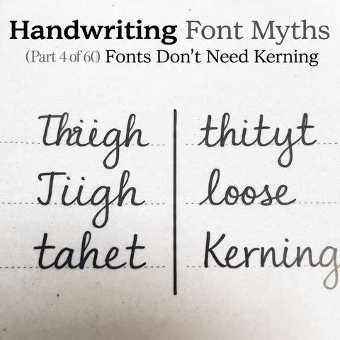
There's a persistent assumption that handwriting fonts get a pass on spacing — that the organic irregularity of the letterforms will naturally absorb or disguise any gaps and collisions between characters. This assumption is wrong, and it leads to fonts that look unfinished rather than authentic. Bad kerning in a handwriting font doesn't read as natural variation. It reads as bad kerning. The eye is quite good at distinguishing between the two, even without conscious awareness.
Kerning a handwriting font is, in several respects, harder than kerning a conventional typeface. The irregular outlines create more collision scenarios. The varied stroke angles produce more optically awkward gaps between specific letter pairs. And the expectation of natural-looking variation means the designer can't simply use consistent mechanical spacing as a fallback — every problematic pair needs a judgment call about what looks intentionally organic versus accidentally broken.
In real handwriting, spacing is handled automatically — the hand responds to the shape of the previous stroke, adjusting intuitively. A font has none of that. Every spacing relationship that happens without thought in real writing must be defined explicitly: advance widths, side bearings, and potentially hundreds of kerning pairs covering combinations that default metrics get wrong. None of this is optional if the goal is a font that actually works in real-world use.