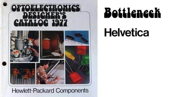
Fabulous cover and typographic treatment on this electronics parts catalogue (an old FIU post): https://fontsinuse.com/uses/4240/optoelectronics-designer-s-catalog-1977

I can just imagine the party line: "yeah i'm a designer... an optoelectronics designer" *suggestive wink*

#OptoElectronics #Bottleneck

Optoelectronics Designer’s Catalog 1977

Bottleneck spotted in the wild. The typographic equivalent of bell bottoms / platform shoes.

Fonts In Use
@drj The Helvetica "downstairs" kinda ruins it form me. That's not to hate on H. in and of itself. But that and the rounded outline... something is off about it.

@pesco Of course there is no design so perfect that it cannot be improved :)

Both the rounded outline/contour and Helvetica (TnT) are very of their time. And i can hear the conversation in my head "Corporate have said it has to say Hewlett-Packard Components on the cover, and it has to be Helvetica").

I agree the combination disrupts the balance.

@drj I overheard the same conversation in my head. ;)
@drj FWIW, i am absolutely *in love* with the use of Helv^WForma DJR in Severance.
https://fontsinuse.com/uses/47788/severance-tv-series
Severance (TV series)

Manifold Extended CF is recurringly used in the TV series Severance. Created by Dan Erickson and directed by Ben Stiller and Aoife McArdle, it premiered on Apple TV+ on February 18, 2022. From Wikipedia: A sinister technology corporation, Lumon Industries, uses a “severance�

Fonts In Use
@pesco what a great post and comments section :)