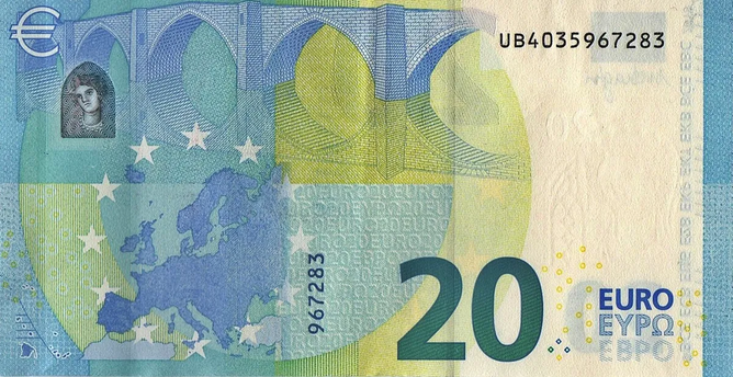
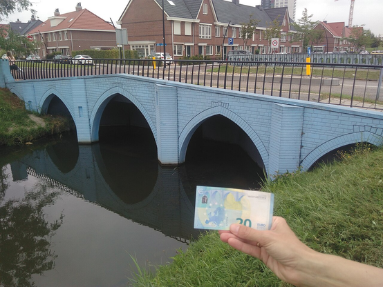
In 1996, tired of squabbling between EU countries about whose favorite person or building should be on the EU banknotes, the currency commission held a competition for a new design: “The ground rules for the design strictly prohibited displaying any recognizable national monuments or heroes that risked giving greater prominence to one country over another.” The winning design was a series of bridges that were stylistically typical of different kinds of European bridges, but which weren't any specific bridges. For example:

Then in 2011 those trolls the Dutch built seven bridges in one town that were all designed to look exactly like the imaginary banknote bridges. They even painted the bridges the same colors as the banknotes.

So now the EU banknotes depict the bridges of Spijkenisse, South Holland. (pop. 72,500)

Norways new banknotes

The beauty of boundaries

@meowki @mjd They are different but how good are their anti-counterfeiting measures?

Historically British banknotes have had two people on them, the reigning monarch on one side and someone dead but famous on the other side.

Back in 1990 when a few series was introduced they increased the size of the face and reduced the body, as they claimed that people were very good at spotting forged banknotes because people were good with faces.

@drajt @meowki @mjd By historically you mean since the 1960s right?
@foxbasealpha @meowki @mjd indeed, 1963 when the queen was on one side and Britannia on the other. Though notes only had two sides and colour after 1957 with the Series B.
@drajt @meowki @mjd The whole furore about replacing historical figures with wildlife is so bogus! Historical figures weren’t introduced until the 70s…. I’m really looking forward to seeing the wildlife designs.