In my constant endeavor to recreate and vectorize the logos of my computers, whether for exhibition signage or just for fun, the original Seequa Chameleon logo has been one that I have struggled with finding a 1:1 font for. Well, until today.
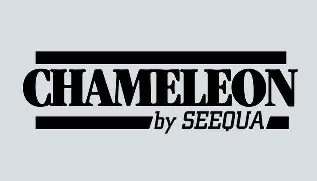
In my constant endeavor to recreate and vectorize the logos of my computers, whether for exhibition signage or just for fun, the original Seequa Chameleon logo has been one that I have struggled with finding a 1:1 font for. Well, until today.
My original recreation used Square Slabserif 711, a font picked by the Monotype font identifier thingy.
Both Square Slabserif and City were designed by the same guy, Georg Trump, so I guess it would make sense they are close.