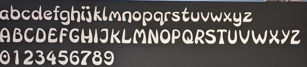
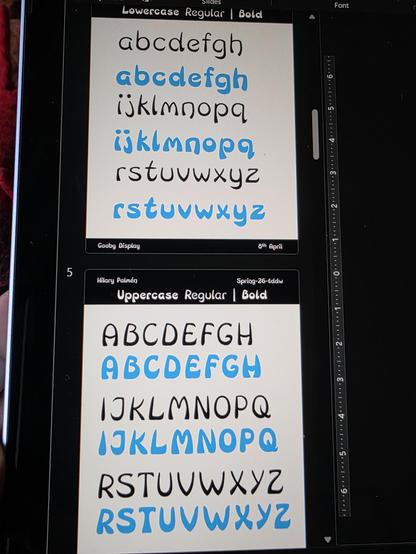
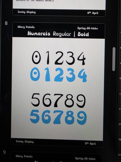
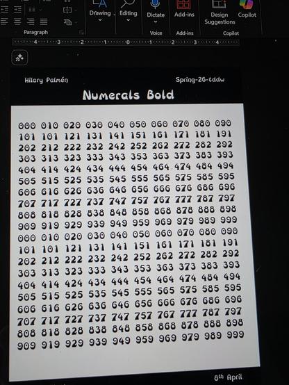
My first bold sketch is not looking too bad.
Unfortunately, I found lots of 'messy' points while making the bold - so it is the Midwest of all versions. Still in Robofont, fir speed before last review office hours session on Wednesday. Then I'll have time to sort out the software.