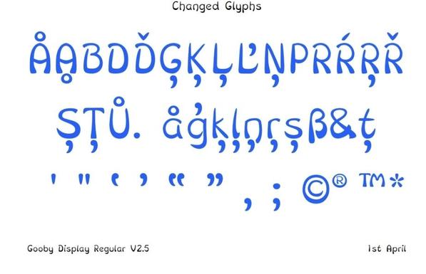
My homework changes to glyphs passed review in class. I also got some great new advice to tackle the things that still irritate me (k K, R), and new advice about typical ways of doing things that I didn't know. It's good to know. A great last class.

My favourite quote from the last class was "the whole course has been worth it just for that g"

#GoobyFont

@Hilary What are some typical ways of doing things that you didn’t know about? 😄

@jlarmstrongiv
One example is being sensitive to looking for where a where a sense of visual wieght might be heavier (e.g. stoke joints like the centre of the x) and ways of tackling that (e.g. slightly increased angles compared to other letters, or the overall style of ink traps).

By being in a class with other people who are improving fonts I learned about typical problems with
Typeface styles I wasbt tackling, but might take on in the future:
- Serifs (curves, styles, font components)
- Reverse contrast
- Making a bold, regular and thin version all work as a system (my next step)

@Hilary thanks for sharing! 😄 I look forward to seeing your bold weight