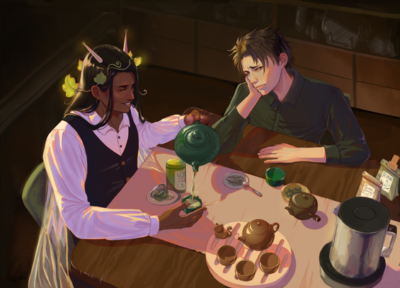
I thought I‘d share a bit of my process, Inspired by @molentum‘s fantastic blog post yesterday about lighting before local color. Here‘s a piece I did last year with the same idea. It goes clean sketch/lines » shadows (NOT values) » gradient map » local color multiply » overpaint

And the thought is to establish the warmer vs cooler tints as the foundation before getting to the final values (although I did a very rough local color layer to „preview“ the final result at this stage)

#MastoArt

I like how much free color/hue variation you get from this process, and how streamlined it is.

But as so often with the separation of values/colors/light etc, it does feel a bit like doing the work twice or triple, and also the result is never as loose as it would be when just painting directly (I think that is the major weakness of this piece, aside from some compositional things that I would change if I re-did this today)

Either way I think it's one of the fun things about digital art, you can always find new ways to make good use of the digital features.

Using gradient maps for actual coloring is something that just never worked for me, neither did the coloring on top of values.

So I wanted to see if it works the other way round and yes, it did feel a lot better to me. I think I may retry it without bw->gradient maps step and paint that light layer directly and see if it works better.

@doombloomart @molentum This is such a cool way to do it! Thank you for sharing
@jankhambrams Glad you found it interesting! :D
@doombloomart Very cool! I've never actually done it in stages like this for a complete piece, I just use it as a thought process for direct painting, but it's an amazing thing about digital art that pretty much any way you like to think about color can be turned into some kind of digital compositing process. The downside to this one is probably that it makes values harder to control, but whatever order you do things it's going to be a tradeoff (values first makes color harder etc)

@molentum You're spot on about it :D the good thing is that you can also kinda work on both kinda simultaneously as long as you keep the layers separate. :D
I could only fit 4 images, but I had a very sketchy local color layer that I just turned on and off to check the values.

It's not my preferred process for most pieces either but I'm glad to have tried it this way.
I find that in the end these things are great for finding initial colors but nothing beats direct painting for the final piece.

@doombloomart whenever i see processes like this my brain just stops working 😂
ive been recommended gradient maps and greyscale to colour workflows so many times before but i always just come back to my "single layer painting on top of sketch" process (or even without sketch if im feeling spicy)..
it just aint meant for me 🙊

@artbyeliza And that's completely fair! I think at some point, layer management is a detriment too.

I tend to think of layers as tools to emulate traditional art techniques: if watercolor is translucent and you have ink underneath, it makes sense to have a digital ink layer on top (or to multiply the watercolor layer on top, same result if the ink is black). Oil painting? Might as well work on one layer, keep maybe a handful for convenience but otherwise nah

@doombloomart i really really want to try oil painting or acrylics that dont dry up quickly 😩
i just never get to it... (+ its hard!!!)
so painting digitally it is for me 
@artbyeliza I never get to oil painting either because it just feels so messy compared to water based mediums, but I really want to as well when I have more spoons again
@doombloomart cursed with a lack of spoons 😔 🤝
@doombloomart I'm doing a similar thing now, with the intent to really mess with the colors deliberately! I've known about and used this technique before, but I didn't have an understanding of why it works till now. That said, it does sort of feel like more work, but I am considering it again for some stuff!