The Census of India has never been very reader-friendly. But in 1970s, a series of events led to government putting effort into publishing very interesting, truly "Indian" #dataviz for the average reader. My new story, with an explorer and some comics! More ⬇️
🔗 diagramchasing.fun/2026/portrai...
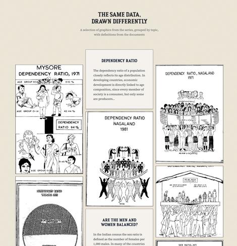
As part of population education, the government mandated that middle and high school students learn about reading charts and statistics and understanding terms like dependency ratio, mortality rates and other such concepts. We end up seeing such interesting takes on #dataviz as a result!
I love the Explorer. You can sort the visualization by visual similarity or geographically. Search usually feels very opaque for these things, so I built an extensive index of topics and chart types for easier exploration. Filter away!
One thing I believe is not restricting readers to only my view of the data. I uploaded all of these census documents on archive.org so that each graphic can open right into that page so you can continue reading it within its source and context. More open, and not just what *I* want you to see.
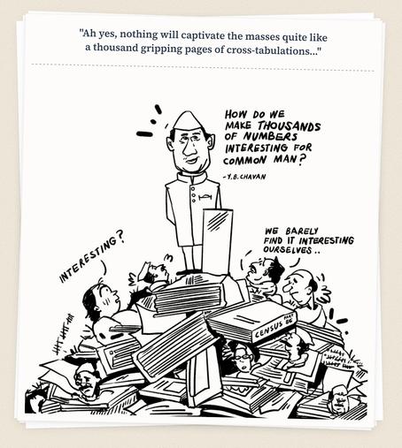
And human-made, artisanal comics for the history section! Loved working with our first external collaborator to produce these because she did a truly wonderful job working with the material. No AI garbage on our blog, ever.
Please read! diagramchasing.fun/2026/portrai...
If you'd like to skip the story and just play with all the graphics and #dataviz, that's okay too! Here's a link directly to the explorer diagramchasing.fun/2026/portrai...
Portraits of Population
Portraits of Population
