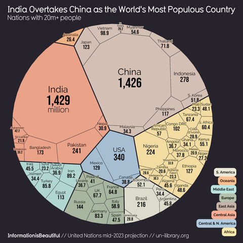
World population visualized
https://informationisbeautiful.net/visualizations/world-population/
https://informationisbeautiful.net/visualizations/world-population/
@infobeautiful re: this viz type
I get the advantage over pie charts that small fractions are more legible in this than very thin slices, but why use irregular polygons in a circle? This makes them very hard to compare without labels and then you're almost down to a fancy looking table with sub totals.
Why not use a tree map instead?