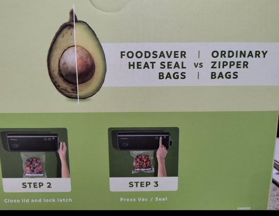
The graphics designer forgot to flip the avocado on this A/B example image on the box
https://lemmy.world/post/44771792
no this is a managerial decision. close is a simple concept (like ‘bigly money’) that the managerial class can understand. so they put it close
Yeah I think they just didn’t want their brand name next to the rotten avocado.
They could place the avocado in the middle, so that it is close to both while still being “correct”