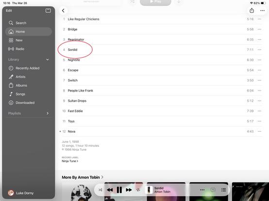
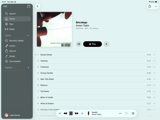
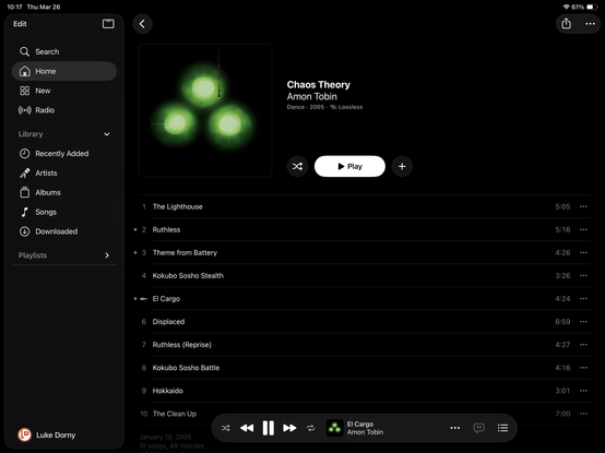
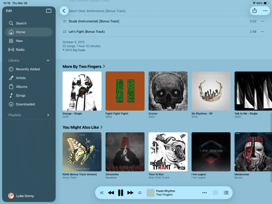
New Music UI design effectively overrides system theme settings/prefs with album cover colors (system set to dark mode).

Where are my retinas at‽
Beautiful, but album covers bleed into the background, and readability and the signaling for “which track is playing” is unreliably confusing.
#design #music #interface

I’ve been tinkering with similar ideas for my own site on my **/NOWPLAYING/** since this version launched years ago. I chose a light and dark color from the album cover, then I have additional extreme light and dark colors to be used for better contrast. Eventually I’d use them in ways that provided for what Apple is doing here, but with more readability. I never completed the task, …and I’m already re-redesigning. 😭🕳️🐇
Respect for the complexity, and here’s hoping it respects light/dark mode better soon, and smartly. #design #music #interface