US annual military recruitment
Shows what a bloody civilian knows.
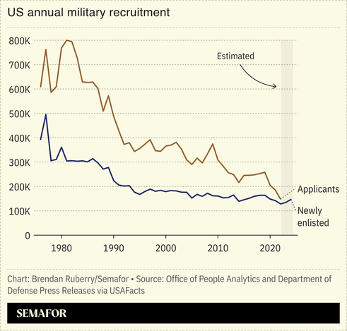
How do you interpret the graph? Or does it just mean “the military can’t afford to have hiring standards anymore?” And does that result in worse soldiers or more loose cannons (i.e., problematic personality profiles), or I suppose that’s probably the same thing?
My interpretation of the graph is that the services have shrunk since the cold war era ended, which is true.
I would imagine that the number of applicants trending downward is likely due to a combination of a stable civilian employment market and a decrease in the recruiting budget. Notice there are spikes in application numbers that correlate with economic downturns, but don’t have an equivalent increase in recruitment.
As for why the lines converge towards the end, my guess would be that although there are fewer applicants, the services still have annual recruiting quotas to maintain force end strength. This will result in a higher percentage of applicants that have waivers for the factors I mentioned in my previous comment.
As for the quality of recruits, I think as a population they are decreasing in quality, but this is no different than trying to apply the BMI standard to an individual to assess their health. You will still have individuals in the population that perform highly, although they are likely a shrinking proportion of those making the cut. Also, there are always a number of people that join and discover the military isn’t for them / what they expected. Some will finish their contract and get out, others will find a way out early. The latter group are the ones that tend to have disciplinary problems and/or are constantly at medical seeking a reason for early discharge.