(comic) Incorporating all feedback https://www.workchronicles.com/p/comic-incorporating-all-feedback
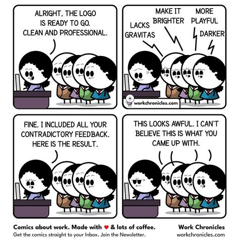
optical illusions to the rescue! i usually change the negative space around the logo. then you can keep the logo the same but make it appear bigger, smaller, darker, lighter, bolder, or thinner.