2/n
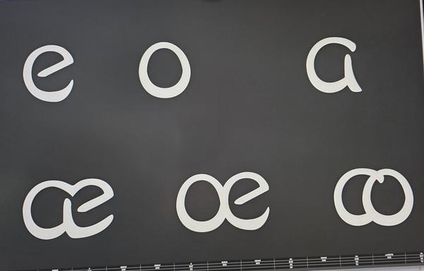
I have no idea how the ligatures that use 'a' affect cognitively diverse readers in the languages that use them.
In my ignorance, I have considered them frippery, fun for designers and readers, that saves space and makes cheeky little design statements.
As a reading researcher, I suspect (untested) that they crowd the text and reduce legibility. They should probably be avoided in a typeface for people at the edges of the normal readership.
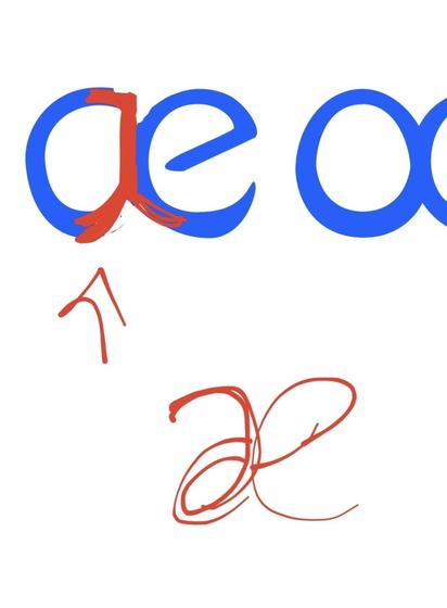
Tutor feedback on my course pointed out that my æ looked really bad in lowercase with a single storey a. I agree. I love the almost mirror-butterfly-esqueness of the normal æ. I can't let-go of consistently using the single-storey 'a' too easily.
Today I've made a couple of explorations, heres the best: