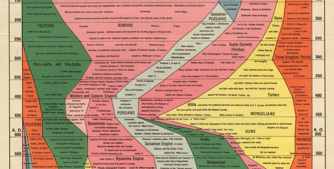
What was the official name of this long foldout map of history-by-area, and does anyone know how they calculated the areas?
https://ygraph.com/graphs/World-History-Map.jpg
Is there a more current version?
What was the official name of this long foldout map of history-by-area, and does anyone know how they calculated the areas?
https://ygraph.com/graphs/World-History-Map.jpg
Is there a more current version?
It’s not how important the area is, it’s how much of the landmass was under the control of each culture/polity.
IIRC!
@clew It was called the Histomap: https://www.visualcapitalist.com/histomap/
I had a copy, might still be around here somewhere.
[edit, some other links: https://www.reddit.com/r/MapPorn/comments/zy11vz/histomap_4000_years_of_world_history_printed_by/ https://www.thehistomap.com/about ]
Oh! Btrinen, you were right, I was wrong, it was trying to map influence??
Well, that’s too much work, adding norms in both the cultural and the metric sense. “Land area under the control of” doesn’t have to add up to 100% either but times it doesn’t are interesting in themselves.
What, do I need to make the map I imagined existed?
I feel like the animator who draws bouncy spheres to represent countries has done a lot of the background work…