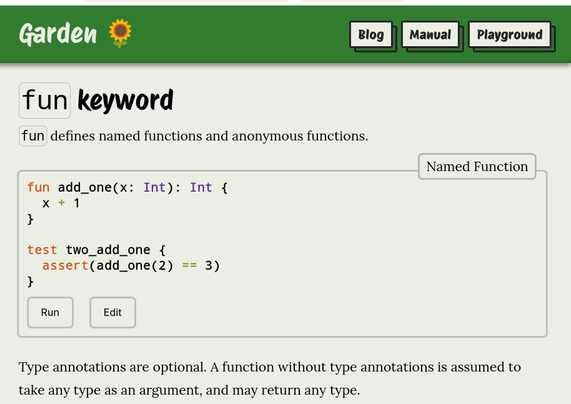
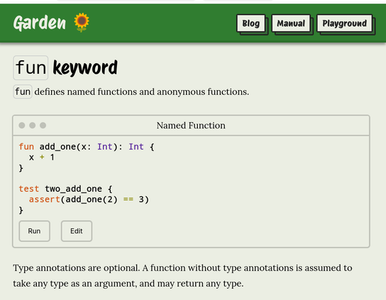
I'm experimenting with imitating window UI elements when showing code snippets on my website.

What do you think? Do the familiar dots of the title bar help, or is it just confusing decoration?

First image is the current style, the second image has the window UI.

@wilfredh

I'd lean toward confusing.

I assume there is no max/min/close function, and that the window isn't draggable/moveable.

The former feels to me gets to the content quicker, and, assuming the page is longer with multiple of these, I think the former also lets me digest more of it while skimming (former: I naturally fall into reading one or two lines of code and then the title and then move on. latter: I infer there's a complex window of sorts and move past until/unless I need it.)

@krinkle @wilfredh same! Confused by UI elements that (in this context) serve no purpose…
@wilfredh i would say no dots thanks. Makes me think there is a menu hidden there or something. But otherwise looking nice.