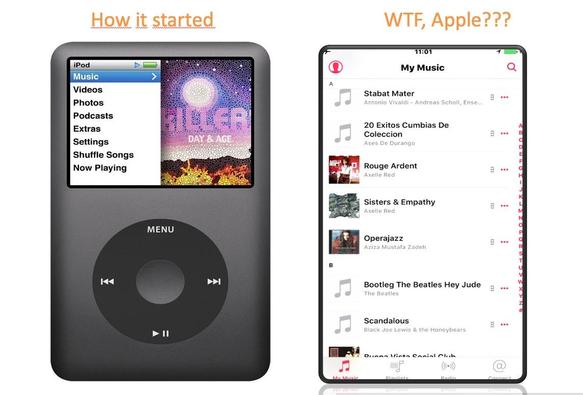
Look how sleek and elegant the UI was in the day of the iPod. Simple, relatable, not a shitty bunch of visual assets blocking the sense of order and searchability. How I miss it.... https://www.tuaw.com/2026/02/25/gen-z-revives-ipods-as-smartphone-fatigue-grows/ #UIfail #Apple #UXfail #ipodgreatdesign
how it started and when I left the stinking Apple UI
So here's the pro tip: Don't put your graphic assets first. Make a searchable list of stuff, and reserve some space on the right hand side for pics, if you must.
Also: iPods don't transmit your sensitive localization data while being on the move all the f-ing time like a phone.