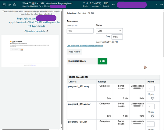
Why do we design UIs with SO MUCH WHITESPACE these days? Why can't this be condensed into a nice tight table?
If someone's grading on mobile, let them use the mobile app, or have the theming increase in size for small screens. Why can this rubric table NOT be much much smaller? Why can this entire thing not show up on one page "above the fold"??